James Billiter Studio Blog

Posts tagged Identity


2011.21/52

England-Idlewild Race Posters

I've been helping out with race promotions for a local mountain bike race. I created a sharp and angular logo, partially because I thought it looked cool, but also it ties into the park's reputation for being filled with thorny rose bushes. Once I created the identity I created a graphic architecture to play off the unique letterforms. I also created a series of icons communicating the many activities the trails provide hikers, runners, cyclists, birders and dog walkers.


2011.13/52

Bird Rescue Logo

A while ago I worked on a logo for a bird rescue. Some days I feel so witty, like a freakin' genius. I noticed the serif of a B looks like a bird beak, and a R looks like a wing. So I created this fun bird icon, the top part is bird, the bottom says rescue. I thought this was clear, simple, elegant, witty. Then I got to the internal review and was blasted out of the water by constructive criticism. Wankers.

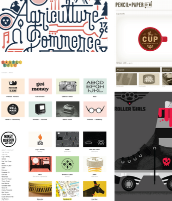
Just some designers and their projects that have been inspiring me lately:

http://statemottosproject.com/gallery/

http://www.danielraycole.com/

http://www.mikeyburton.com/

http://YoungJerks.com/#598329/God-Bless-The-Midwest

http://www.pencilpluspaper.com/


Another week kicking out some sweet graphic jams. Making sweet logos using visual wit, tons of custom lettering and pretty cycling kit designs. This week I'm also pouring some out for my dead concepts — something that worked in my head but not quite on paper.

The middle logo is for my wife whose bike racin' nickname is B-jet short for Bridget.
James BilliterIdentity


A couple quick identity sketch concepts for an excellent photographer and friend. I hope to make a lovely mark and a slightly intrusive watermark. The bottom captures the idea of a shutter/bike wheel in a pretty color wheel — this might look lovely with overlapping transparent shapes.
James BilliterIdentity, Sketch


2011.2/52

For my second week/art piece of 2011 I created identity variations on the Educational Foundation for the Colorado National Guard. I love this part of the process — creating simple solutions that are very effective and use a combination of symbols to create a new meaning to creating something abstract and poetic.

The logo I featured is a book (closed, as if finished, symbolic of graduation), tilted upwards for optimism and also to symbolize flight. I created dynamic energy within the icon which begins to imply the E anf F letterforms.

In future rounds of work I hope to create custom logo-typography as well.