James Billiter Studio Blog

Posts tagged Poster
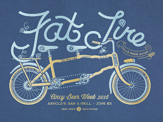
Fat Tire Beer Poster

When: June 23, 2016 @ 6pm.
Artist: James Billiter. One of Cincinnati’s busiest artists right now, with shows all over town and a steady stream of art coming out. Billiter has done posters for bands Wussy, The Cincinnati Dancing Pigs, Jake Speed and the Freddies, Wild Leaves and more.
Event: Poster Release + Tappings of New Belgium/Rhinegeist Fat Tire Collaboration, Barrel Aged Mushushu and the super rare New Belgium Nitro Coffee Sour — Oscar Worthy Coffee.
New Belgium / Rhinegeist Fat Tire Collaboration: Rhinegeist has transformed Fat Tire into a Belgian XPA, combining a fruity Belgian yeast strain with bready-sweet European and Colorado malts for a beer to please hopheads and wine drinkers alike.
Rhinegeist Mushushu is a blend of four black beers aged in bourbon barrels for more than six months, this melange strikes a dynamic balance of wood character with the addition of coffee, vanilla and cocoa nibs. Panther Porter – 50% Bertha Milk Stout – 30% Ink Imperial Stout – 10% Panda Oatmeal Stout – 10%. ABV: 8.5%
New Belgium’s Oscar Worthy Coffee: Oscar Worthy Coffee. Three words, that when uttered, cause an almost Pavlovian drool response among New Belgium co-workers. Like our dry-hopped sour Le Terroir, Oscar Worthy Coffee is a beer unlike any other: It’s our sour Oscar “dry-beaned” with coffee in collaboration with Fort Collins friends The Bean Cycle. The result is an ultra-smooth sour beer that bursts with sour-and-espresso aromas, and it tastes like magic. ABV 6.7%
New Solo Show at frameshop in OTR


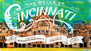
Walls of Cincinnati: New Works in Watercolor Monoprints and Serigraphs by Billiter Studio
CINCINNATI, OH - 

"Walls of Cincinnati," a show of new monoprints and serigraphs by Billiter Studio, 
opens May 27th from 6-10pm at frameshop, 1317 Main Street.

On Final Friday the walls of frameshop will be adorned with the beautiful façades of our Queen City. “The Walls of Cincinnati: Monoprints and Serigraphs” by James Billiter Studio features articulate, illustrated renderings of Cincinnati’s landmarks. These landmark art prints are a combination of monoprint originals featuring watercolor dyes as well as affordable handprinted, limited-edition screen prints. Frameshop will be complimenting these elaborate art prints with exquisite and unique framing using a variety of heritage materials. Aside from the framed originals, a variety of frame-ready screenprints will be available, ranging in prices from $10 to $50.


For more information visit the event page https://www.facebook.com/events/279904965679057/
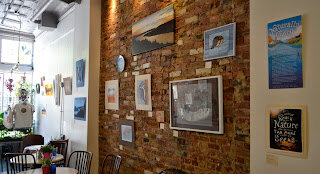
Naturally Cincy: a collection of my nature work


 I've been very busy producing a lot of work. Printmaking and illustrating, inspired by all my outdoor interests. My work will be at Park + Vine through May 25.

  My Artist Statement: I am a lifelong Cincinnatian who was reared on family camping trips into the Great Outdoors. I cherished these trips into Nature where life was simpler and more elemental. But as a city slicker there is a divide between my everyday life and the mystery of the Natural world.

Over the past several years I find myself often spending time outside and have reconnected with Nature. Through hiking, cycling, running and rowing I observe plants and animals. With child-like wonder I take in these new experiences compelled to unravel these mysteries — I find myself inspired. 

Along my bike commutes I see the sun rise over our majestic Ohio River valley and glow golden as it sets in the west. The light sparkes and dances along our hillsides. I can’t capture these moments with a camera so I replicate their beauty in my landscapes.

 As a boy I was captivated by the work of Charley Harper, I found his style based upon elementary forms delightful and inventive. As I have gotten older the work of Harper, along with John Ruthven and John James Audubon have inspired me as a designer and illustrator and this new collection of animal artwork that I have observed in nature.

Between our City Parks, the nature preserves and our great river ecosystems we are blessed with an abundance of Nature around us. I want my work to inspire all of us to appreciate these Natural resources and for us to celebrate conservation on this 45th anniversary of Earth Day.

My favorite places to visit:
Cincinnati City Parks: Ault Park, Burnett Woods, Caldwell Nature Preserve Eden Park, French Park, Mount Airy Forest and Otto Armleter Park.
Cincinnati Nature Center
South 80 Trails
Valley View Nature Preserve Little Miami Conservancy
The Nature Conservancy’s Red Bird Hollow


Creative Pursuits: James Billiter—Naturally Cincy by Adam Sievering
As an outdoor enthusiast who has spent the last decade sharing his talent at LPK, Senior Designer James Billiter experiences the duality of city life and the great outdoors on a daily basis. His upcoming art exhibit, Naturally Cincy, explores the symbiotic relationship between his work and time spent outside, illuminating nature’s extraordinary ability to feed creativity and nurture the imagination—right here in Cincinnati.

James’ connection to nature stems from camping trips during childhood. “I cherished these trips into nature where life was simpler and more elemental,” he says. “But as a city slicker, there’s a divide between my everyday life and the mystery of the natural world.”

He helps bring these two worlds together by riding his bike to work, channeling daily inspiration from natural surroundings in the Ohio River valley. When he’s not commuting or intimately involved with Creative Suite at his desk, it’s a safe bet he’s spending his time outdoors.

“Through hiking, cycling, running and rowing, I can reconnect with nature,” he says. “I observe animals and sometimes wonder what really distinguishes their daily lives from my own. I take in these new experiences, compelled to unravel these mysteries. I find myself inspired.”

In addition to drawing inspiration from nature, James highlights its therapeutic value.

“I’m kind of a workaholic, so when I’m outside it helps me cleanse and detox. It’s like a retreat from my daily stresses. Instead of multitasking, I find myself focused on nothing but what I’m experiencing in that moment. It’s a form of active meditation,” he says.

Naturally Cincy is a culmination of these experiences, celebrating the beauty of Cincinnati’s parks, nature preserves and river ecosystems with a range of illustrative styles inspired by the works of Charley Harper, John Ruthven and John James Audubon.

“The exhibit is a combination of realistic portraits and playful illustrations,” he explains. “I wanted it to be accessible to anyone.”

“Even more so,” he adds, “I want my work to inspire all of us to appreciate the abundance of nature around us and celebrate conservation on the 45th anniversary of Earth Day.”

Naturally Cincy opens Saturday, April 26th and runs until Sunday, May 25th at Park + Vine (1202 Main St, Cincinnati, OH 45202).
Down from the Mountains!

Inspired by last summer's trip to see the USA Pro Cycling Challenge in Colorado—I entered this submission into a contest for the lovely city of Breckenridge. Can't wait to go out and visit my family again this summer!

Check out my Flickr photo set of all my cycling posters:


Digging the new Facebook page as well:


  .
James BilliterPoster


12 in 12 #3
USA PRO CYCLING CHALLENGE POSTERS

There was a Facebook contest where people can upload posters and judges and the public can vote on them.

One vision I had was inspired by my 2002 visit to Colorado Springs, where we saw Pike's Peak and the Garden of the Gods.

My poster option for the main contest was inspired by the feeling of speed and upward movement, climbing the great mountains of Colorado. I contacted a professional photographer/journalist who covers pro cycling races. The contest states that you must own the rights to the imagery you use, so even if I had the photographer's permission I would not have the model release rights to the image of the pros. Thus I was stuck using a less than perfect image for my main race poster. If selected, I wouldn't mind using an image supplied by the race organization if they owned the rights to it.


I was riding my bike along, thinking about Cincinnati's (the Queen City of the Ohio) bike lane issue along Riverside Drive. We are planning on going to a bike parade and picnic on Saturday night. This image of the Keep Calm poster came to my mind and I said "God Save the Lanes!" in my mind.

I used a Queen's crown as well as a old-school illustration of a bicycle to make the poster feel, ole-fashiony! I was planning on attaching these to my bike for the parade, but the City Council just passed the go-ahead for the lanes!
James Billiter2012, Parody, Poster


I dig the video, never realized that this poster was never actually used in wartime. I like the type, it's like "what if Wes Anderson was a bloke."


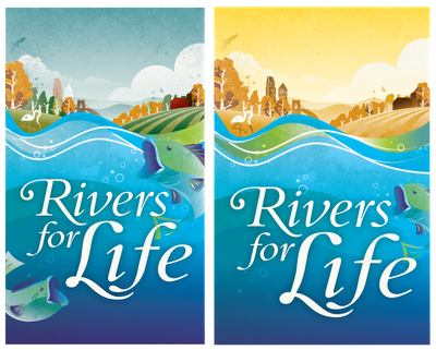
I created a new illustration for a local lecture on the environment. It was to incorporate some of the illustrations I have been developing for the past couple years. I created a full color option, but the duotone option tends to highlight the water more.


2011.40/52

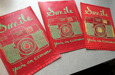
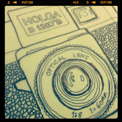
Camera Illustration and "Smile, You're on Camera" poster

I'm making the annual coloring book for my nieces and nephews and I am converting my photography into illustrations (part of the whole analoging the analog thing I've been talking about). So I'd thought I'd make a camera, then this fun poster popped into my head too.


2011.38/52

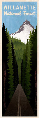
Willamette National Forest

I was so inspired by my vacation last summer. Driving through the forest, giant redwood trees would perfectly frame beautiful mountains. I started sketching while I was there and I have finally found the time to create the art.


2011.34/52

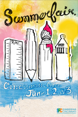
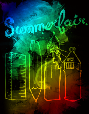
Summerfair Poster Concepts

Sometimes in art recycling doesn't pay. I thought I could take the illustrations I created for AEQAI and use them for a Summerfair poster. I ran out of time because I have been busy with work and life, so my recycling experiment failed.

Someone made the observation that it should be more about Coney Island and not Downtown. Also, I kind of felt it weighed a bit too heavily towards the visual arts. I should do more research into the event and tray again next year.

I was planning on hand-illustrating all the type on the bottom.


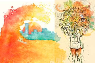
And some inspiration:


2011.35/52

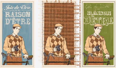
Dandy Poster Series II

This is going to be kind of like an Andy Warhol project for me. I think I can keep tweaking and refining my portrait, and I ma planning on rolling it out with different quotes and colors. Since the last iteration I have added more detail to my face and I have a second (although less sophisticated) design for the typography. The one in the middle will be a fun tweed option to be unveiled in the future.


2011.32/52

Devou Backcountry Bonanza Poster

Ever have one of those projects where you need to get a lot of info into one device? Well, the only thing I could thing of was to go all out with fancy typography.


2011.31/52

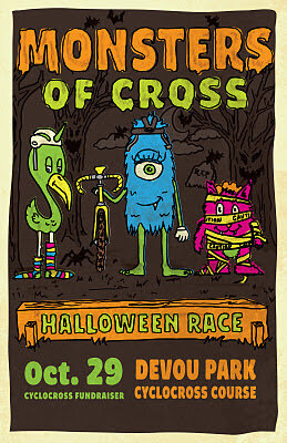
Monster of Cross Poster

I wanted to contribute to a local cause; the construction of a permanent cyclocross course in Devou Park, Kentucky. I don't have a ton of cash coming out of my pockets so I decided to set up this event and do the design for the poster.

I wanted it to be for the whole family, so I created these fun cartoon character. I wanted to continue to push my hand-drawn, from scratch, slow-design aesthetic. Unfortunately I didn't have a lot of time to finesse my work, I feel like the characters could be a bit more refined. Design and life is a process, this design is finished and I will try to improve my character design skills in future projects.


2011.30/52

Ohio Valley Cyclocross Poster

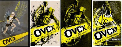
I created the OVCX logo as well as the posters and aesthetics for the website back in 2009. You can see some of my past posters here.

With the logo I wanted to pair a contemporary, clean logotype (with a hint of speed and sportiness) with the idea of a caution tape containing device (a cyclocross race course is typically lined with caution tape, watch some racing here).

In previous years I wanted to hint at nostalgia by mimicking a classic cyclocross poster using illustration. Last year I gave it a bit of an aggressive street art edge. But this year I've been very busy and I wanted to make it easy on myself.

So I collaborated with Dion Easthouse of VeloVivid.com, who has an incredible eye for the dramatic. Dion shoots incredible photos with shallow depth-of-field and vibrant colors. Like myself, he also captures images with a nostalgic edge. The image we selected for this poster shows a rider grinding through the mud and snow, captured in a warm black and white which compliments the yellow caution tape quite nicely.

I gave it a bit of an exaggerated trompe l'oeil effect by having the rider interact with the caution tape holding device. I thought this would be fun bursting off of a bike shop window.
James Billiter52 in 2011, Poster


2011.28/52

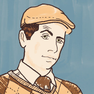
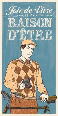
Dandy Portrait, version 1

A year ago the design firm I work for (LPK) hired photographers to shoot portraits of us doing things we dig. I like retro stuff, photography and cycling so I put it all together in a "All Creatures Great and Small" portrait of a Tweedy Dandy out for a spin on his 3-speed.

My Sister drew a portrait of her boyfriend for his business card, and I also dug some packaging I saw from Upton's Naturals. I got jealous so I thought it would be fun to draw my own. I plan to create different versions similar to how Andy Warhol or Shephard Fairey works. This one features my personal motto, which one could interpret as "I live for life's little pleasures."


2011.27/52

"Never Go To Bed Angry" Film Poster

So for years I have been developing these films about a character named Dede Nerveux. They are my love-letters to my French heritage and the work of the Nouvelle Vague films of the 1960s. I tend to borrow a lot from Truffaut (and his alter ego Antoine Doinel), Romer and Godard with a Noah Baumbach (à la "Mr. Jealousy") romantic comedy with a dark vibe sometimes.

Like Truffaut and Doinel, Dede acts as my alter ego and although these works are fictional the writing and creating of them offers some insight and education into and of my personal views.

For this poster I was inspired by a poster for Truffaut's "Jule et Jim," mixing hand drawn elements over photography. I used interior decor elements such as wallpaper to create a pattern in the background. I also created hand-drawn type to for the word Angry to tie into the wallpaper and linework over the photography.


In the process of creating this year's poster I looked back at my process from last year. 2009 I recreated a classic poster and in 2010 I tried to put a contemporary spin on the poster. It's interesting to see the trial and error and process.