James Billiter Studio Blog

Posts tagged 52 in 2011


2011.40/52

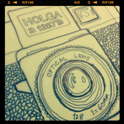
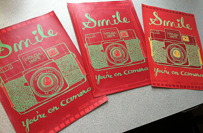
Camera Illustration and "Smile, You're on Camera" poster

I'm making the annual coloring book for my nieces and nephews and I am converting my photography into illustrations (part of the whole analoging the analog thing I've been talking about). So I'd thought I'd make a camera, then this fun poster popped into my head too.


2011.38/52

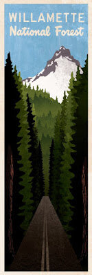
Willamette National Forest

I was so inspired by my vacation last summer. Driving through the forest, giant redwood trees would perfectly frame beautiful mountains. I started sketching while I was there and I have finally found the time to create the art.


2011.37/52

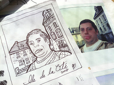
Analog Analog World: Drawings of Photos I have Taken

I'm resurrecting my drawing project, turning it into a fun coloring book for my nieces and nephews. I decided to interpret some of my favorite film photographs (holgas, polaroids, 35mm, etc.) into drawings that children and adults can enjoy. I'll post more as I go!


2011.36/52

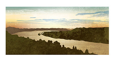
Vector Landscape: The Bend of the Ohio River as seen from Eden Park

This is a breathtaking view that I get to take in when I bike commute to work. A few years ago I go into illustration nature scenes as the background for cyclocross posters. It is interesting the see the similarities and differences between a photo and the style and embellishment that an illustration can provide.


2011.34/52

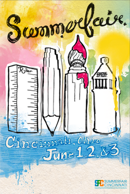
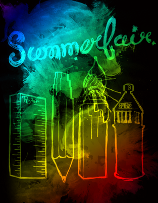
Summerfair Poster Concepts

Sometimes in art recycling doesn't pay. I thought I could take the illustrations I created for AEQAI and use them for a Summerfair poster. I ran out of time because I have been busy with work and life, so my recycling experiment failed.

Someone made the observation that it should be more about Coney Island and not Downtown. Also, I kind of felt it weighed a bit too heavily towards the visual arts. I should do more research into the event and tray again next year.

I was planning on hand-illustrating all the type on the bottom.


And some inspiration:


2011.35/52

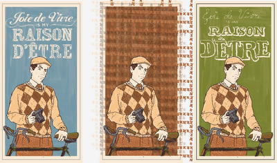
Dandy Poster Series II

This is going to be kind of like an Andy Warhol project for me. I think I can keep tweaking and refining my portrait, and I ma planning on rolling it out with different quotes and colors. Since the last iteration I have added more detail to my face and I have a second (although less sophisticated) design for the typography. The one in the middle will be a fun tweed option to be unveiled in the future.


2011.33/52

CrossBot 2000 Costume

I really want to push myself out of my comfort zone and created something sculptural. My friend Josh made this really cool mask out of cardboard, and I really liked the idea of that. Halloween was coming up, and I was volunteering at a festive cyclocross race so I thought I would turn the project into a costume.

I was initially inspired by the geometric designs of African tribal masks, but whenever I started to sketch something it began to look way more like a robot, so I just went with it.


2011.32/52

Devou Backcountry Bonanza Poster

Ever have one of those projects where you need to get a lot of info into one device? Well, the only thing I could thing of was to go all out with fancy typography.


2011.31/52

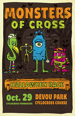
Monster of Cross Poster

I wanted to contribute to a local cause; the construction of a permanent cyclocross course in Devou Park, Kentucky. I don't have a ton of cash coming out of my pockets so I decided to set up this event and do the design for the poster.

I wanted it to be for the whole family, so I created these fun cartoon character. I wanted to continue to push my hand-drawn, from scratch, slow-design aesthetic. Unfortunately I didn't have a lot of time to finesse my work, I feel like the characters could be a bit more refined. Design and life is a process, this design is finished and I will try to improve my character design skills in future projects.


2011.30/52

Ohio Valley Cyclocross Poster

I created the OVCX logo as well as the posters and aesthetics for the website back in 2009. You can see some of my past posters here.

With the logo I wanted to pair a contemporary, clean logotype (with a hint of speed and sportiness) with the idea of a caution tape containing device (a cyclocross race course is typically lined with caution tape, watch some racing here).

In previous years I wanted to hint at nostalgia by mimicking a classic cyclocross poster using illustration. Last year I gave it a bit of an aggressive street art edge. But this year I've been very busy and I wanted to make it easy on myself.

So I collaborated with Dion Easthouse of VeloVivid.com, who has an incredible eye for the dramatic. Dion shoots incredible photos with shallow depth-of-field and vibrant colors. Like myself, he also captures images with a nostalgic edge. The image we selected for this poster shows a rider grinding through the mud and snow, captured in a warm black and white which compliments the yellow caution tape quite nicely.

I gave it a bit of an exaggerated trompe l'oeil effect by having the rider interact with the caution tape holding device. I thought this would be fun bursting off of a bike shop window.
James Billiter52 in 2011, Poster


2011.29/52

Scoffing Escoffier Blog

I was creating fancy type for a project so I re-used it and created a fun header for a blog where I keep and share my favorite recipes. I thought "Scoffing Escoffier" has a nice ring to it, but in some ways it's a bit pretentious. I'm not that much of a foodie!


2011.28/52

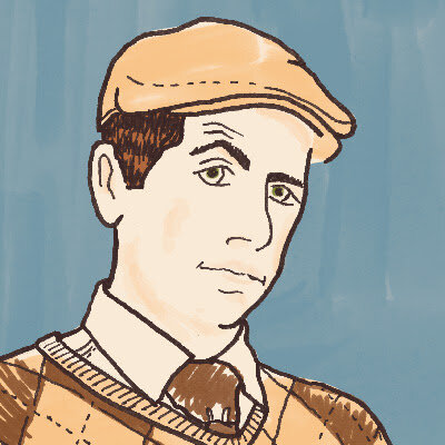
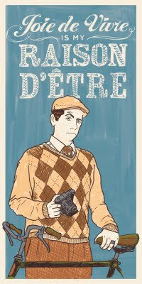
Dandy Portrait, version 1

A year ago the design firm I work for (LPK) hired photographers to shoot portraits of us doing things we dig. I like retro stuff, photography and cycling so I put it all together in a "All Creatures Great and Small" portrait of a Tweedy Dandy out for a spin on his 3-speed.

My Sister drew a portrait of her boyfriend for his business card, and I also dug some packaging I saw from Upton's Naturals. I got jealous so I thought it would be fun to draw my own. I plan to create different versions similar to how Andy Warhol or Shephard Fairey works. This one features my personal motto, which one could interpret as "I live for life's little pleasures."


2011.27/52

"Never Go To Bed Angry" Film Poster

So for years I have been developing these films about a character named Dede Nerveux. They are my love-letters to my French heritage and the work of the Nouvelle Vague films of the 1960s. I tend to borrow a lot from Truffaut (and his alter ego Antoine Doinel), Romer and Godard with a Noah Baumbach (à la "Mr. Jealousy") romantic comedy with a dark vibe sometimes.

Like Truffaut and Doinel, Dede acts as my alter ego and although these works are fictional the writing and creating of them offers some insight and education into and of my personal views.

For this poster I was inspired by a poster for Truffaut's "Jule et Jim," mixing hand drawn elements over photography. I used interior decor elements such as wallpaper to create a pattern in the background. I also created hand-drawn type to for the word Angry to tie into the wallpaper and linework over the photography.


2011.26/52

German-American Fusion Dinner
"Hähnchenschnitzel mit Frische RotKraut und Kartoffelpfankuchen" (may be incorrect, my German is very bad)

My goal for "52 in 2011" was to tap into my creativity and find new inspiration, broaden my creative palette and produce a larger amount of personal work. This creativity can reach outside the bounds of visual art, as long as I am creating.

A few years ago I discovered cooking. And while I feel I am not the best, I love to refine and perfect recipes and come up with my own creations. This blog was actually started when I visited Germany, France and Switzerland on a business trip in 2006. I loved the food, but I find a lot of German food tastes like garbage in the US.

So I came up with my own spin on some German classics, mixing some fairly stereotypical dishes with healthy ingredients to make a hearty meal. I made Chicken Schnitzel with a fresh red cabbage slaw/kraut and sweet potato pancakes.

I will post the recipe in the future.

2011.25/52

NoLA!

A while back I created this "logo" from a collection of old Woodtype letterforms. I miss our vacation, it was nice! So relaxing and a ton of great food.


2011.24/52

Foggy May in CincyTown

A really rough cell phone pic actually looks pretty nice. It was a foggy day and the typical view looking out from Eden Park was obscured. This view of the foggy lake, with the sun trying to pierce through the fog highlighting my bike resting against a tree. I love these little moments that happen during my bike commutes.


2011.23/52

Around the bend, sunrise over the Ohio Valley in March

I often stop in Eden Park for a moment of serenity during my morning bike commutes to work. I love to look out and as the sun rises it abstracts the hills and river into a series of hazy shapes and tones intersecting with each other as they disappear back into the horizon.


2011.22/52

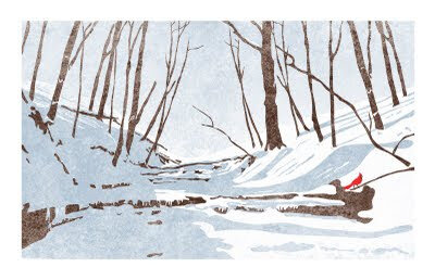
Snowy Creek in Red Bird Hollow

I was hiking last winter and noticed how stark and beautiful the scenery was. One could easily reduce the scene down to three tones — white, grey and black. I did add some subtle hue to these tones, a bluish grey and using a very dark brown instad of black. I brought in a surprise hit of a fourth color, a single red bird as a reminder of this place's namesake.

It took me awhile to sit down and implement my vision, but I am glad I can use this artwork to remember this year. I was hiking here with my elderly dog named Button, a 13 year old Brittany. Unfortunately she passed away this spring, so I hope when I see this illustration in the future I will be reminded of her.


2011.21/52

England-Idlewild Race Posters

I've been helping out with race promotions for a local mountain bike race. I created a sharp and angular logo, partially because I thought it looked cool, but also it ties into the park's reputation for being filled with thorny rose bushes. Once I created the identity I created a graphic architecture to play off the unique letterforms. I also created a series of icons communicating the many activities the trails provide hikers, runners, cyclists, birders and dog walkers.