James Billiter Studio Blog

2011.28/52
Dandy Portrait, version 1
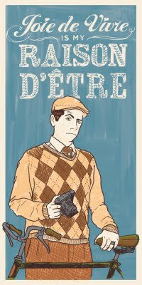
A year ago the design firm I work for (LPK) hired photographers to shoot portraits of us doing things we dig. I like retro stuff, photography and cycling so I put it all together in a "All Creatures Great and Small" portrait of a Tweedy Dandy out for a spin on his 3-speed.
My Sister drew a portrait of her boyfriend for his business card, and I also dug some packaging I saw from Upton's Naturals. I got jealous so I thought it would be fun to draw my own. I plan to create different versions similar to how Andy Warhol or Shephard Fairey works. This one features my personal motto, which one could interpret as "I live for life's little pleasures."

2011.27/52
"Never Go To Bed Angry" Film Poster
So for years I have been developing these films about a character named Dede Nerveux. They are my love-letters to my French heritage and the work of the Nouvelle Vague films of the 1960s. I tend to borrow a lot from Truffaut (and his alter ego Antoine Doinel), Romer and Godard with a Noah Baumbach (à la "Mr. Jealousy") romantic comedy with a dark vibe sometimes.
Like Truffaut and Doinel, Dede acts as my alter ego and although these works are fictional the writing and creating of them offers some insight and education into and of my personal views.
For this poster I was inspired by a poster for Truffaut's "Jule et Jim," mixing hand drawn elements over photography. I used interior decor elements such as wallpaper to create a pattern in the background. I also created hand-drawn type to for the word Angry to tie into the wallpaper and linework over the photography.

2011.20/52
Let them eat Cupcakes!
Since I am of French ancestry I like to throw a Bastille Day party — it's a different spin than the 4th and you can play up the Frenchiness a bit and act posh. Last time was a bit of a chore feeding people and being a good host, so this year I thought an after dinner cupcake party might be a bit fun, perhaps trying to pair the cupcakes with different wines.
I was inspired a Gucci script logo for the headline, but my original idea was a bit more similar to the Hostess cupcake coily pattern in the type. I created custom type design for Bastille Day, inspired by the blades of the Guillotine. And the information at bottom uses an ornate blade style box housing some classic Didot typography.


A couple of fancy type samples I saw while I was in New Orleans.
Images from Fleurdlicious and A Wardrobe of Whiskey.

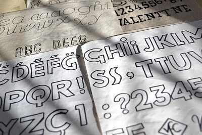
I love hand-drawing my typography. It harkens back to the old days of hand-painted signs, and photostat logos and lettering. Sometimes I trace these in Illustrator and clean them up, but other times I use them in their rough state with all their humanistic flaws and irregularities.
I did a bunch of typefaces — some inspired by the title cards in Jean Luc Godard's films, some by old art nouveau perfume packaging.
A bit of decadence for the holidays

For the past year my workload has been pretty diversified and I really love it. I work on everything from detergent to water to snacks to air fresheners to chocolate to liqueur and sometimes coffee and identity projects.
I love customizing a design to fit a unique brand and their consumers. I create a lot of typography for custom logos and it is something I have had a passion for since design school.


