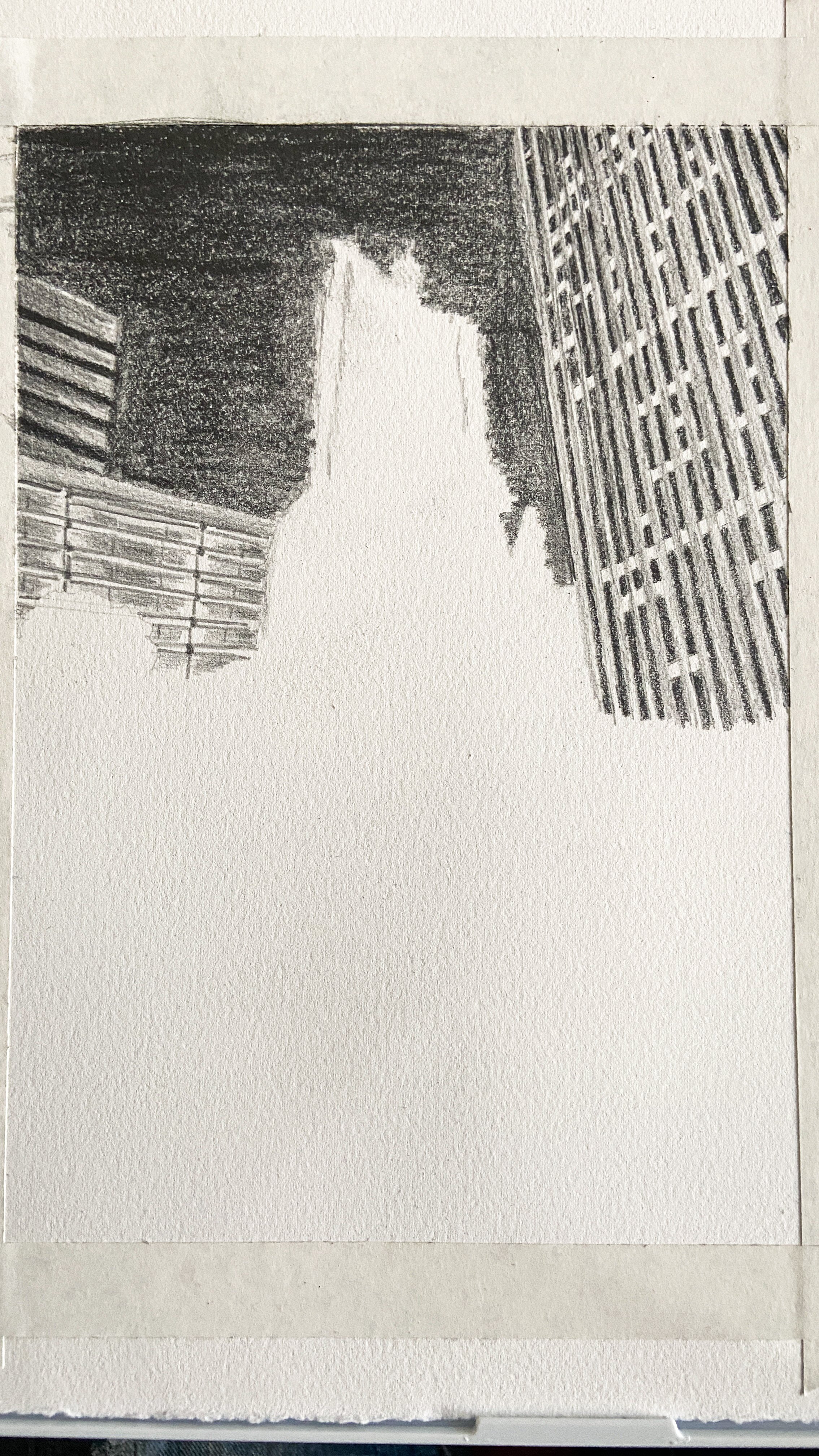
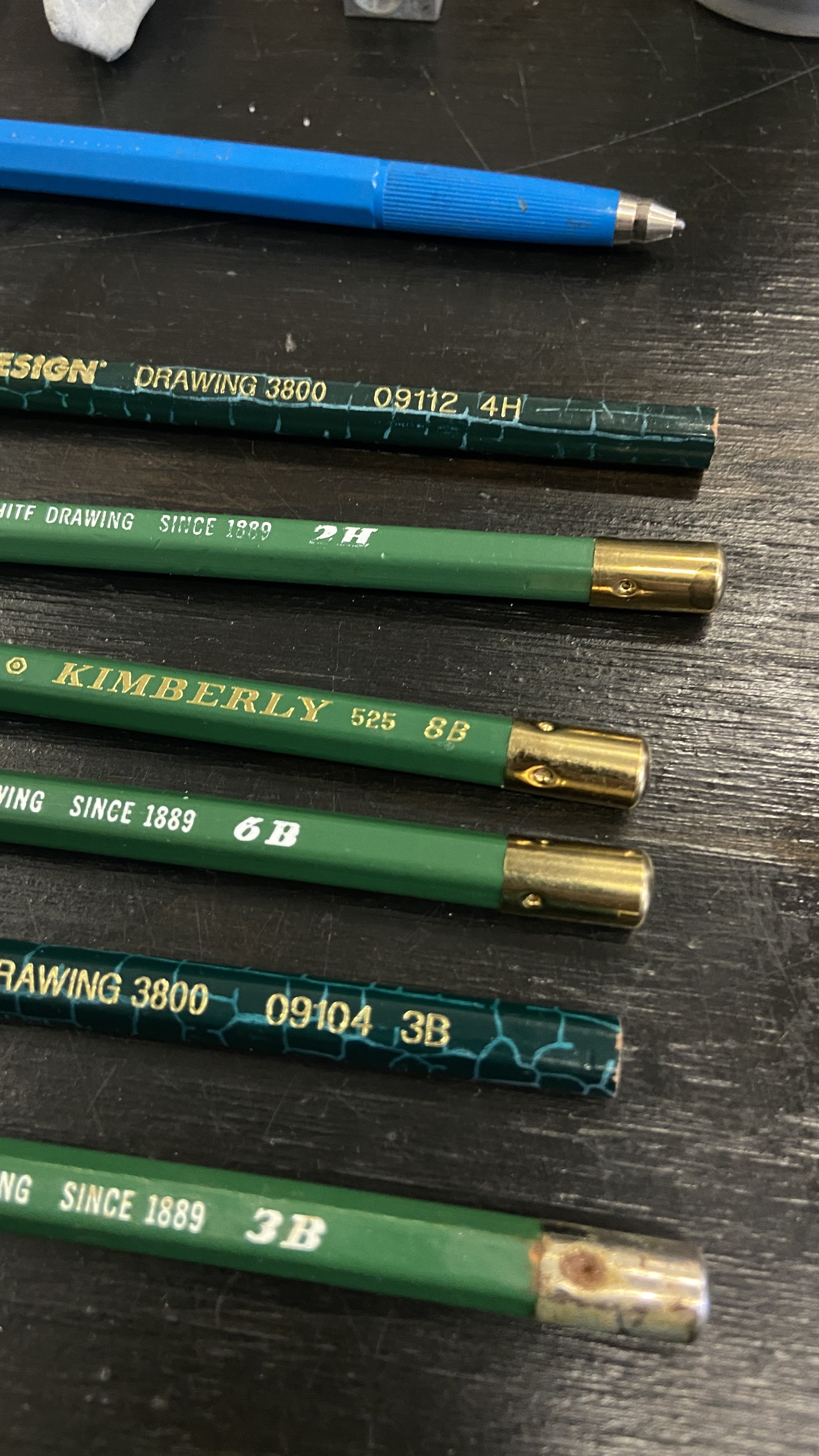
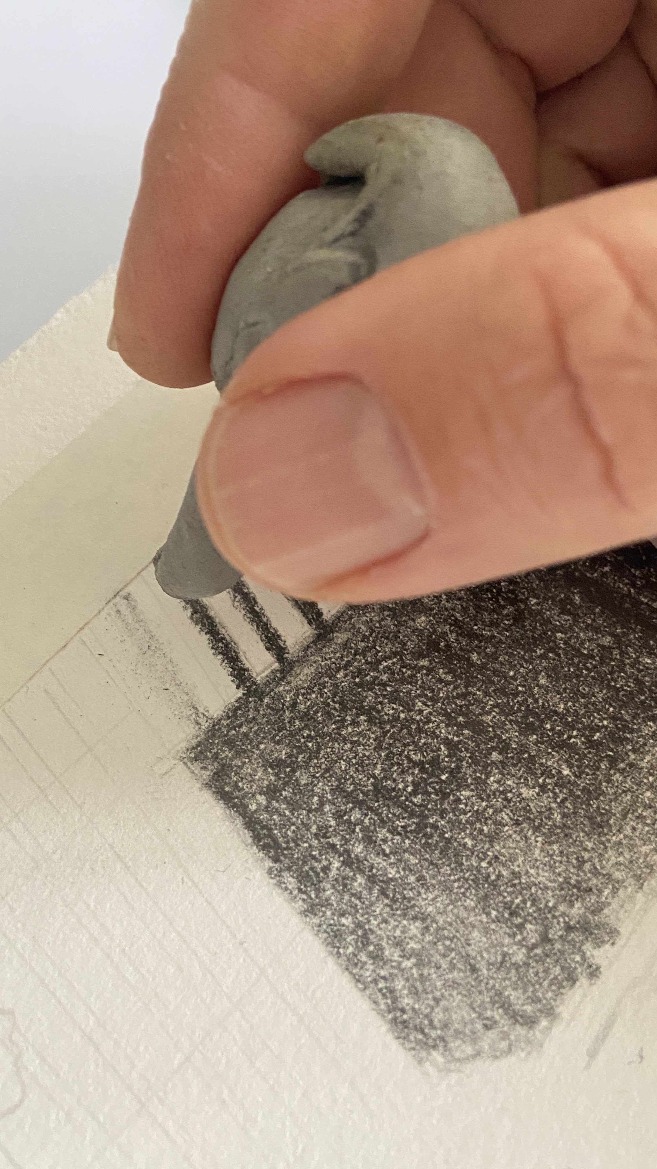
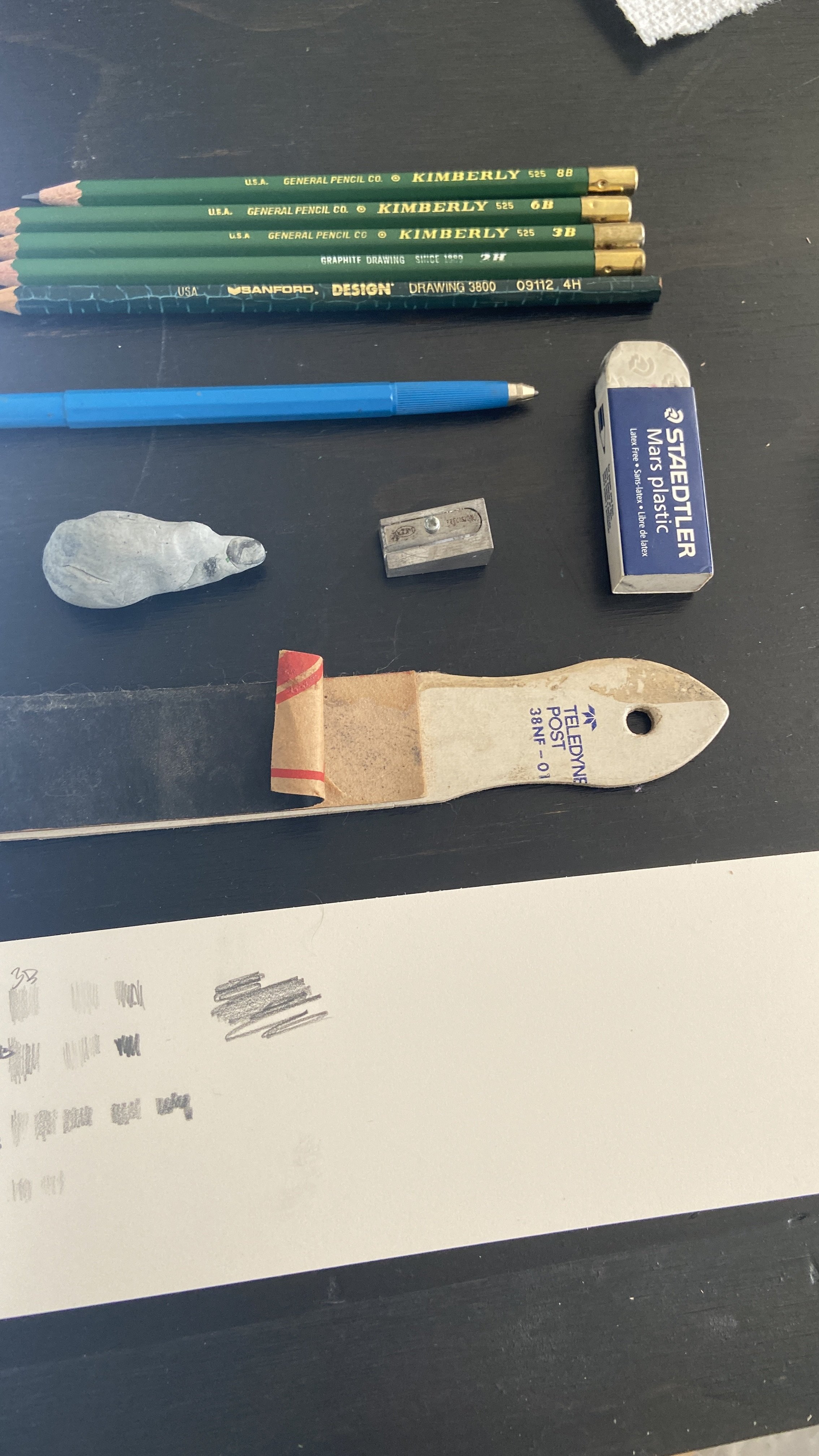
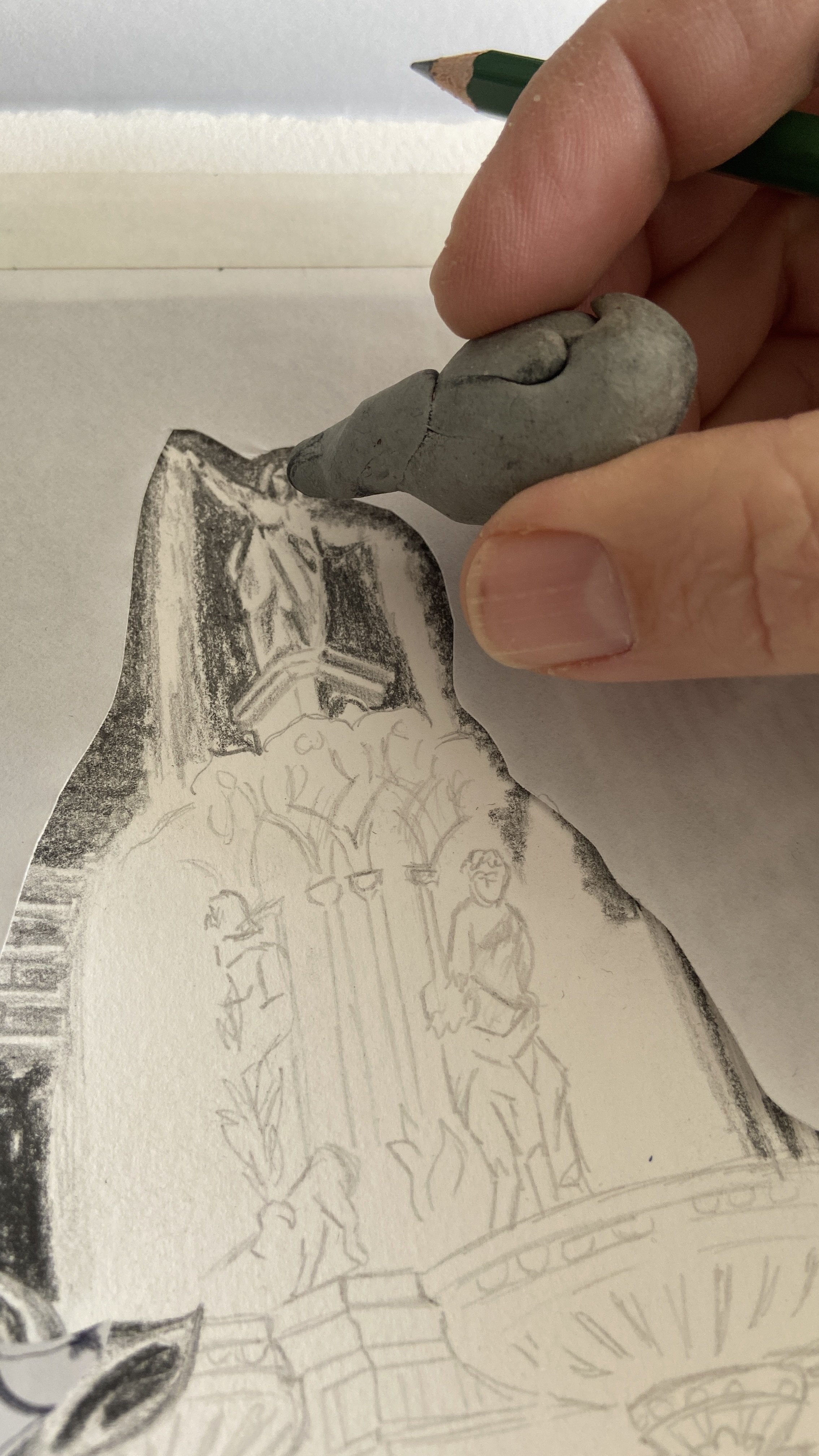
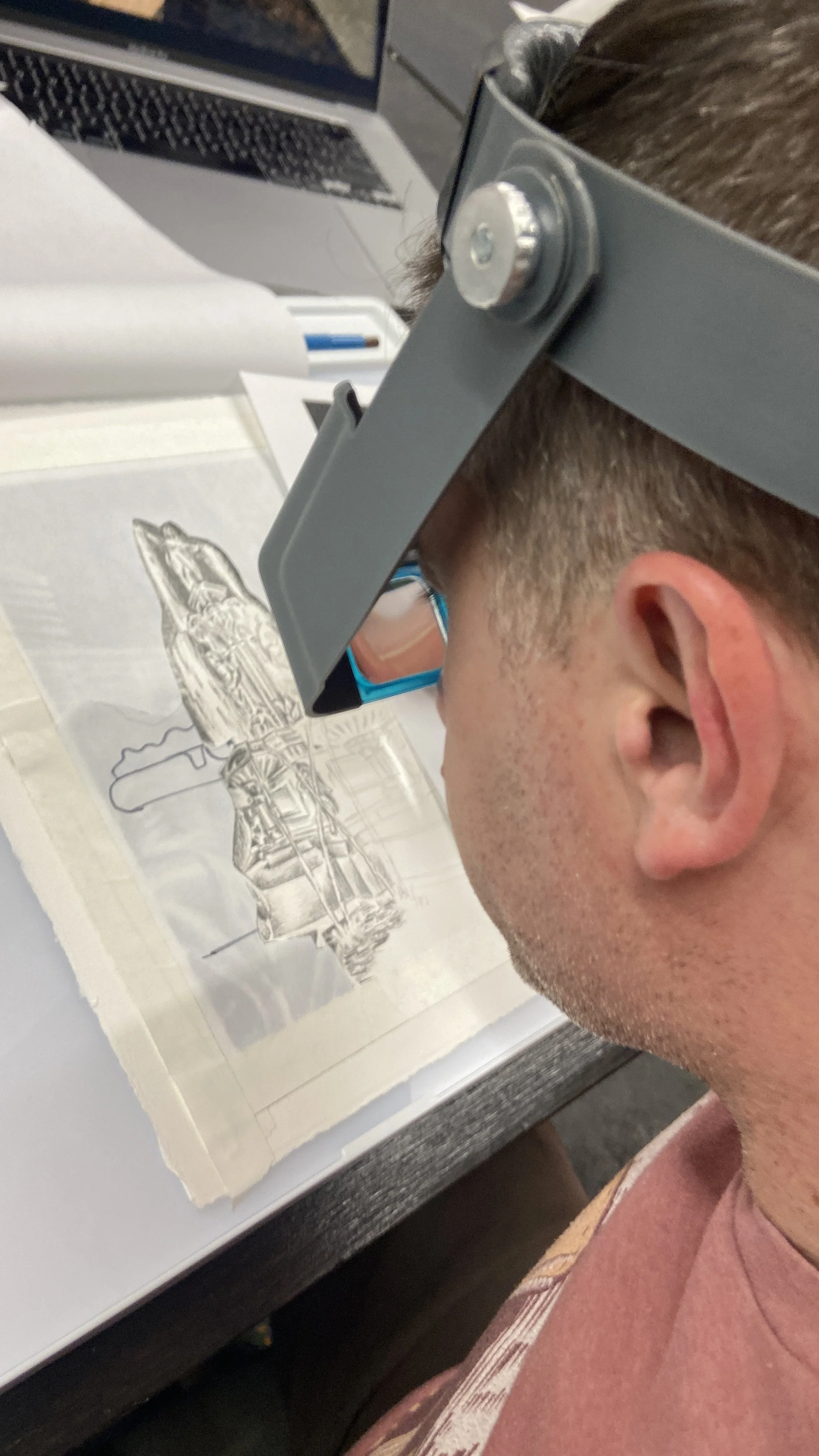
I’ve been working on a graphite drawing. Dusting off my pencils and skills after learning a ton in Design Drawing during my first year in design school back in 1996.
Planning to experiment to see how the graphite texture screenprints.
This image was inspired by a 5mile walk last summer with my dog Kona, where we went through Newport and Covington then visited the Square during a Hip Hop concert. I love when downtown is full of people, arts and vibrancy!
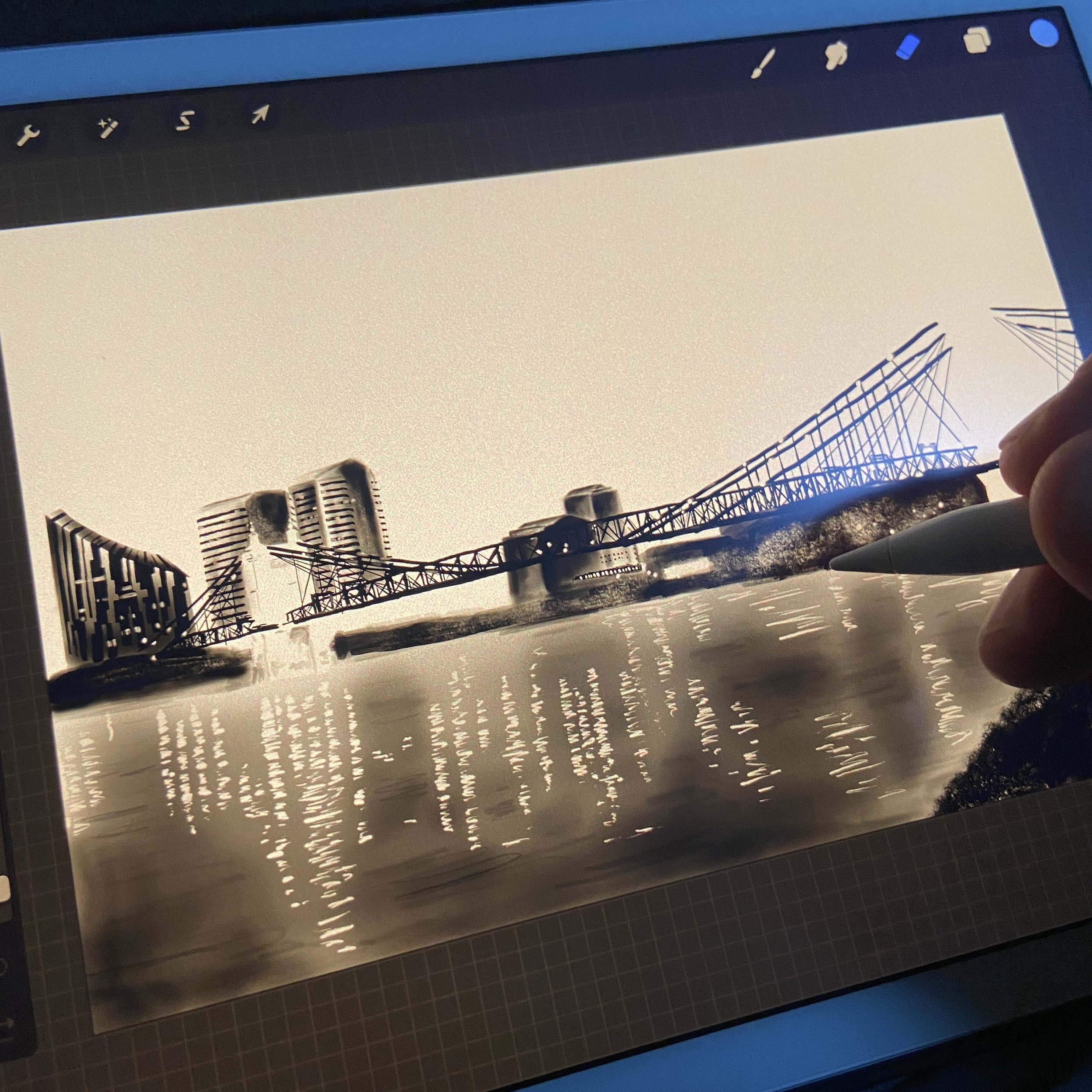
“Covington Riverfront at Dusk” work in progress — using ProCreate on the iPad to illustrate an urban landscape. I plan to personally screenprint a 30” x 20” version.
I started work last August during my first visit to Detroit. I really enjoyed evening rides along their river walk then coming back to my hotel and cuddling up with my iPad. Drawing can be so relaxing and I should do more before bedtime.
Not quite finished yet, so far I’ve spent about 15 hours in the image, enjoying the shading.
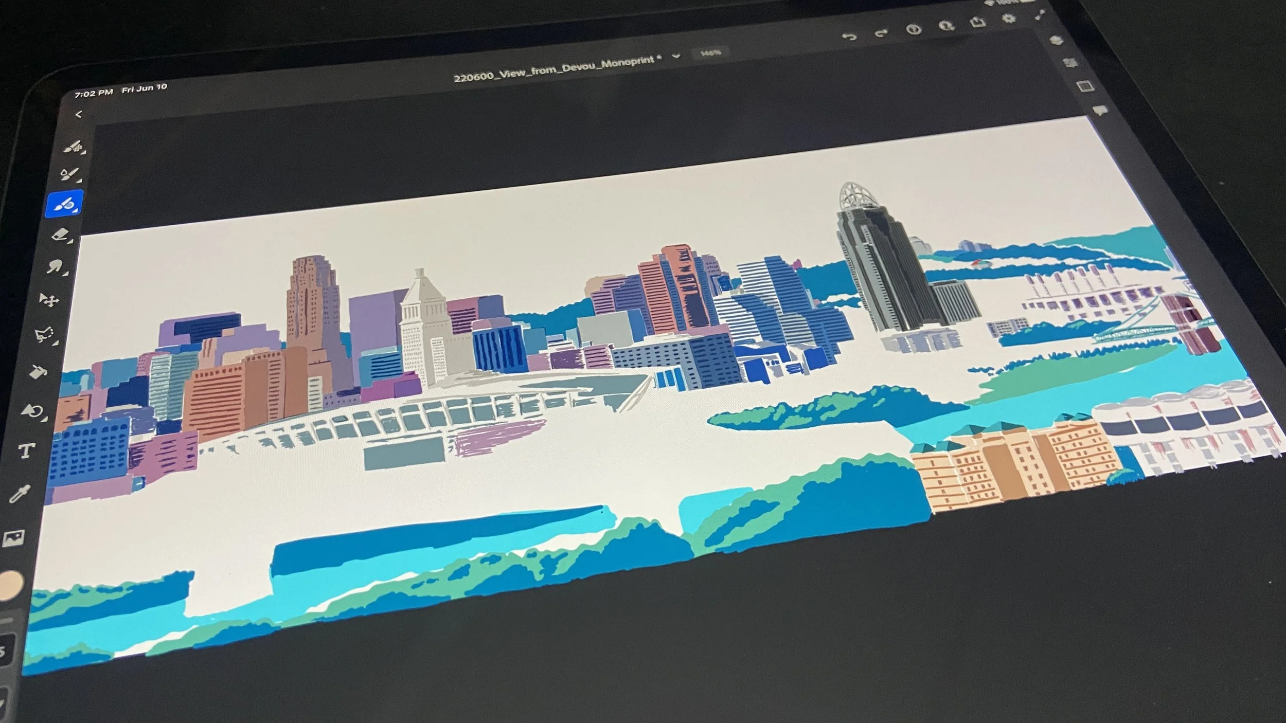
“View from Devou” work in progress from June. Relaxed on a lovely family vacation to Red River Gorge by drawing a scene in Adobe Fresco on an iPad in the evenings and mornings.
I was inspired to work on a fun watercolor screenprinted monoprint after binge-watching episode of “Painting with John” and watching the watercolor spread.
Hoping to create a watercolor monoprint of this scene in the upcoming months as part of my Queen City Scenes collection
The past few years I feel like I've been balancing commissions with maintaining the Cincinnati Heritage Collection. I have been experimenting here and there with styles and developing new collections.
I've settled on a new collection that feels less graphic arts and advertising based and more observational art prints of scenes. This new collection may still be based in Cincinnati, but it feels a bit more liberating and I enjoy capturing reference imagery and using printmaking to capture reality in a stylized manner.
The prompt of 12 in '22 is inspired
—a
that really started this current chapter of my career. In 2011 I felt very stagnant creatively, so I set the goal of creating 1 piece of artwork or creativity per week to re-inspire myself. With this new prompt of 12 in '22 I want to create 1 strong piece per month, and focus on quality of execution during the development of this new collection of work.
Last year I had the pleasure to develop a new piece experimenting in this new style to the Tiger Lily Press Calendar. I went to the Cincinnati Riverfront in the evening and photographed reference for a great cropping of 3 landmarks from our skyline that would fit into a 6" x 8" crop. I spent about 17-18 hours illustrating the scene, and about 16 hours printing 150 of the 3-color prints (what a long day!).

I'm planning to adapt this series to other mediums as well; for instance an idea for a woodblock of the riverfront at night (see below) and also to continue my work in Polyester Lithography as well.

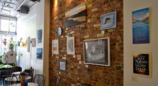
I've been very busy producing a lot of work. Printmaking and illustrating, inspired by all my outdoor interests. My work will be at Park + Vine through May 25.
My Artist Statement: I am a lifelong Cincinnatian who was reared on family camping trips into the Great Outdoors. I cherished these trips into Nature where life was simpler and more elemental. But as a city slicker there is a divide between my everyday life and the mystery of the Natural world.
Over the past several years I find myself often spending time outside and have reconnected with Nature. Through hiking, cycling, running and rowing I observe plants and animals. With child-like wonder I take in these new experiences compelled to unravel these mysteries — I find myself inspired.
Along my bike commutes I see the sun rise over our majestic Ohio River valley and glow golden as it sets in the west. The light sparkes and dances along our hillsides. I can’t capture these moments with a camera so I replicate their beauty in my landscapes.
As a boy I was captivated by the work of Charley Harper, I found his style based upon elementary forms delightful and inventive. As I have gotten older the work of Harper, along with John Ruthven and John James Audubon have inspired me as a designer and illustrator and this new collection of animal artwork that I have observed in nature.
Between our City Parks, the nature preserves and our great river ecosystems we are blessed with an abundance of Nature around us. I want my work to inspire all of us to appreciate these Natural resources and for us to celebrate conservation on this 45th anniversary of Earth Day.
My favorite places to visit:
Cincinnati City Parks: Ault Park, Burnett Woods, Caldwell Nature Preserve Eden Park, French Park, Mount Airy Forest and Otto Armleter Park.
Cincinnati Nature Center
South 80 Trails
Valley View Nature Preserve Little Miami Conservancy
The Nature Conservancy’s Red Bird Hollow
Creative Pursuits: James Billiter—Naturally Cincy by Adam Sievering
As an outdoor enthusiast who has spent the last decade sharing his talent at LPK, Senior Designer James Billiter experiences the duality of city life and the great outdoors on a daily basis. His upcoming art exhibit, Naturally Cincy, explores the symbiotic relationship between his work and time spent outside, illuminating nature’s extraordinary ability to feed creativity and nurture the imagination—right here in Cincinnati.
James’ connection to nature stems from camping trips during childhood. “I cherished these trips into nature where life was simpler and more elemental,” he says. “But as a city slicker, there’s a divide between my everyday life and the mystery of the natural world.”
He helps bring these two worlds together by riding his bike to work, channeling daily inspiration from natural surroundings in the Ohio River valley. When he’s not commuting or intimately involved with Creative Suite at his desk, it’s a safe bet he’s spending his time outdoors.
“Through hiking, cycling, running and rowing, I can reconnect with nature,” he says. “I observe animals and sometimes wonder what really distinguishes their daily lives from my own. I take in these new experiences, compelled to unravel these mysteries. I find myself inspired.”
In addition to drawing inspiration from nature, James highlights its therapeutic value.
“I’m kind of a workaholic, so when I’m outside it helps me cleanse and detox. It’s like a retreat from my daily stresses. Instead of multitasking, I find myself focused on nothing but what I’m experiencing in that moment. It’s a form of active meditation,” he says.
Naturally Cincy is a culmination of these experiences, celebrating the beauty of Cincinnati’s parks, nature preserves and river ecosystems with a range of illustrative styles inspired by the works of Charley Harper, John Ruthven and John James Audubon.
“The exhibit is a combination of realistic portraits and playful illustrations,” he explains. “I wanted it to be accessible to anyone.”
“Even more so,” he adds, “I want my work to inspire all of us to appreciate the abundance of nature around us and celebrate conservation on the 45th anniversary of Earth Day.”
Naturally Cincy opens Saturday, April 26th and runs until Sunday, May 25th at Park + Vine (1202 Main St, Cincinnati, OH 45202).
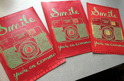
2011.40/52
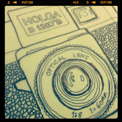
Camera Illustration and "Smile, You're on Camera" poster
I'm making the annual coloring book for my nieces and nephews and I am converting my photography into illustrations (part of the whole analoging the analog thing I've been talking about). So I'd thought I'd make a camera, then this fun poster popped into my head too.
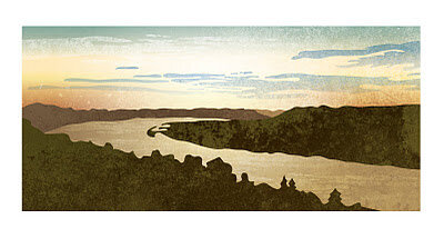
2011.36/52
Vector Landscape: The Bend of the Ohio River as seen from Eden Park
This is a breathtaking view that I get to take in when I bike commute to work. A few years ago I go into illustration nature scenes as the background for cyclocross posters. It is interesting the see the similarities and differences between a photo and the style and embellishment that an illustration can provide.
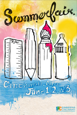
2011.34/52
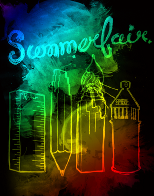
Summerfair Poster Concepts
Sometimes in art recycling doesn't pay. I thought I could take the illustrations I created for AEQAI and use them for a Summerfair poster. I ran out of time because I have been busy with work and life, so my recycling experiment failed.
Someone made the observation that it should be more about Coney Island and not Downtown. Also, I kind of felt it weighed a bit too heavily towards the visual arts. I should do more research into the event and tray again next year.
I was planning on hand-illustrating all the type on the bottom.
And some inspiration:
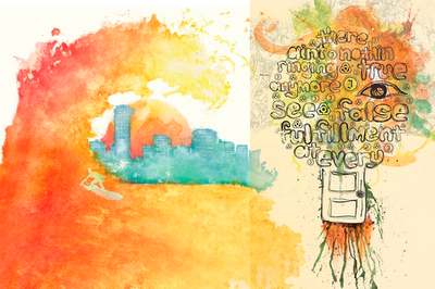
2011/04 Christoph Niemann from CreativeMornings on Vimeo.
Saw this fun video on this blog. Good times.
2011.28/52
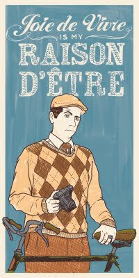
Dandy Portrait, version 1
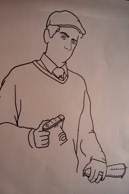
A year ago the design firm I work for (LPK) hired photographers to shoot portraits of us doing things we dig. I like retro stuff, photography and cycling so I put it all together in a "All Creatures Great and Small" portrait of a Tweedy Dandy out for a spin on his 3-speed.
My Sister drew a portrait of her boyfriend for his business card, and I also dug some packaging I saw from Upton's Naturals. I got jealous so I thought it would be fun to draw my own. I plan to create different versions similar to how Andy Warhol or Shephard Fairey works. This one features my personal motto, which one could interpret as "I live for life's little pleasures."
Trying to get back into more hand-drawn "slow design." Here is a cool process video of Kevin Tong making a poster.
2011.22/52
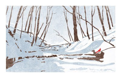
Snowy Creek in Red Bird Hollow
I was hiking last winter and noticed how stark and beautiful the scenery was. One could easily reduce the scene down to three tones — white, grey and black. I did add some subtle hue to these tones, a bluish grey and using a very dark brown instad of black. I brought in a surprise hit of a fourth color, a single red bird as a reminder of this place's namesake.
It took me awhile to sit down and implement my vision, but I am glad I can use this artwork to remember this year. I was hiking here with my elderly dog named Button, a 13 year old Brittany. Unfortunately she passed away this spring, so I hope when I see this illustration in the future I will be reminded of her.
2011.11/52
Cincinn-ARTY
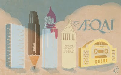
Dustin, a colleague at work curates and seeks submissions of artwork for AEQAI, an online journal of Cincinnati's visual arts.
He contacted me about created a Splash page visual for the April edition of AEQAI. I wanted to create something specific for the magazine, so the idea of Cincinnati's landmarks becoming tools for making art popped into my head. A cold modernist building like the Kroger building is a ruler, the Carew Tower is a number Ca2ew pencil, Central Trust is a can of spray paint sky-writing AEQAI, the new Great American building is a brush and Union Terminal is a boom box (part of graffiti culture and performance art). I was kind of inspired by New Yorker magazine covers.
I'm excited to be part of a group of my favorite local designers like Dustin, Keith Neltner and Tommy Sheehan.

