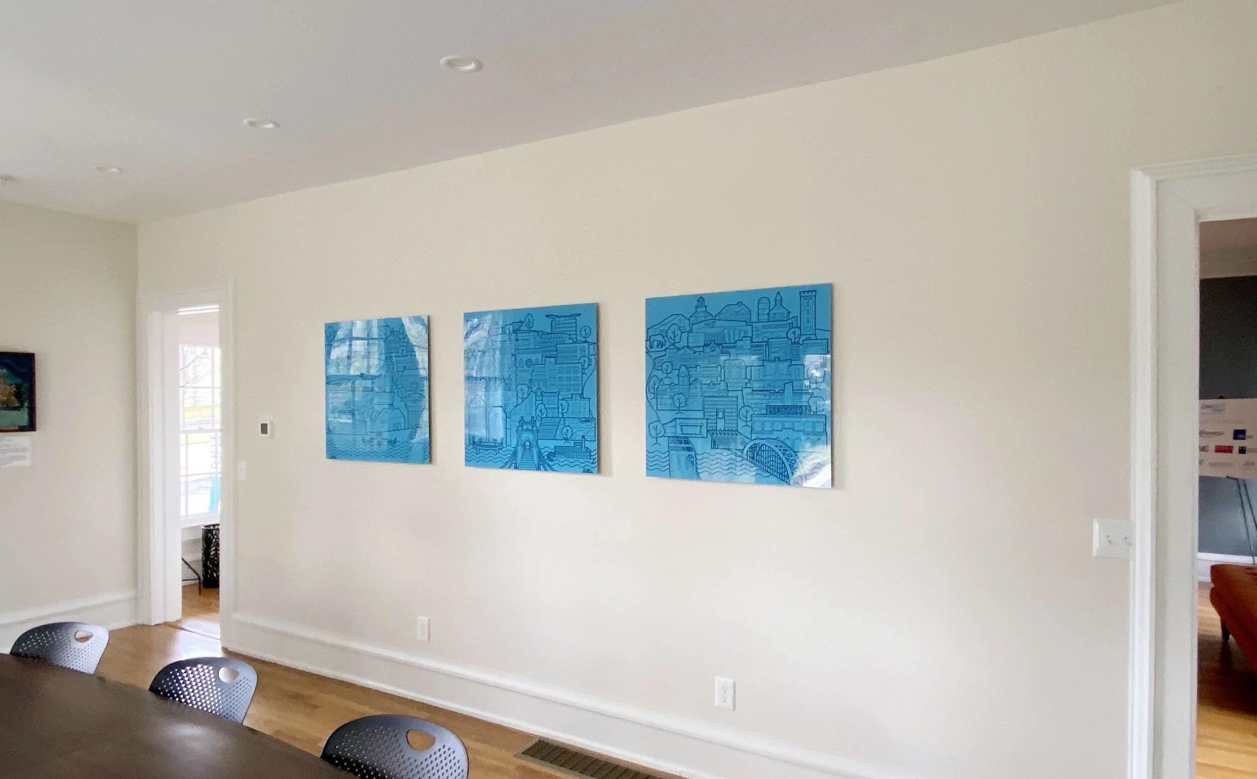
OneNKY Frankfort House Triptych
OneNKY Alliance unifies the three counties of Northern Kentucky and community leaders from many sectors to create positive change and transformation in the community. Their Frankfort office enables organizations and sponsors to convene and meet while in the state capitol and this triptych is intended to create a sense of pride for those community members.
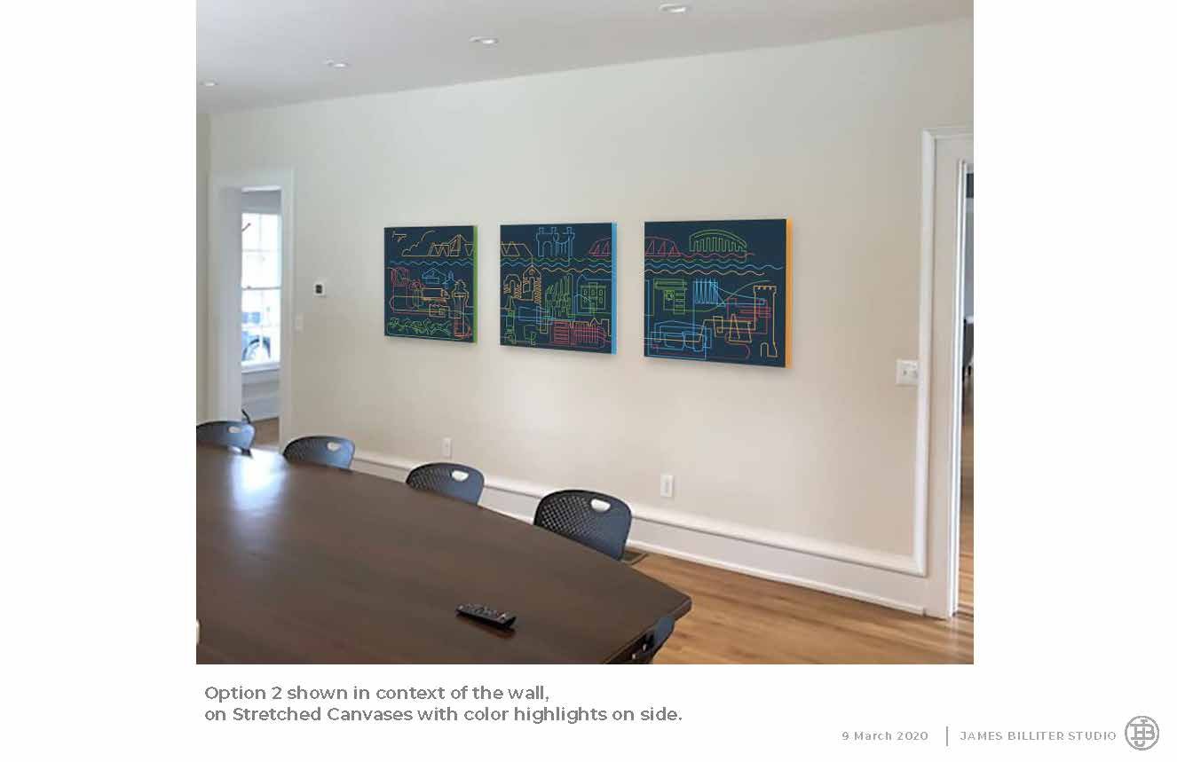
The final triptych was created by working with Cincinnati’s Robin Imaging to transfer the images to their HD Steel Panels. This production method complimented OneNKY’s modern aesthetic and branding but also would be durable within a space meant for meetings, meals and gatherings — the steel was also very lightfast in a room full of windows and light.
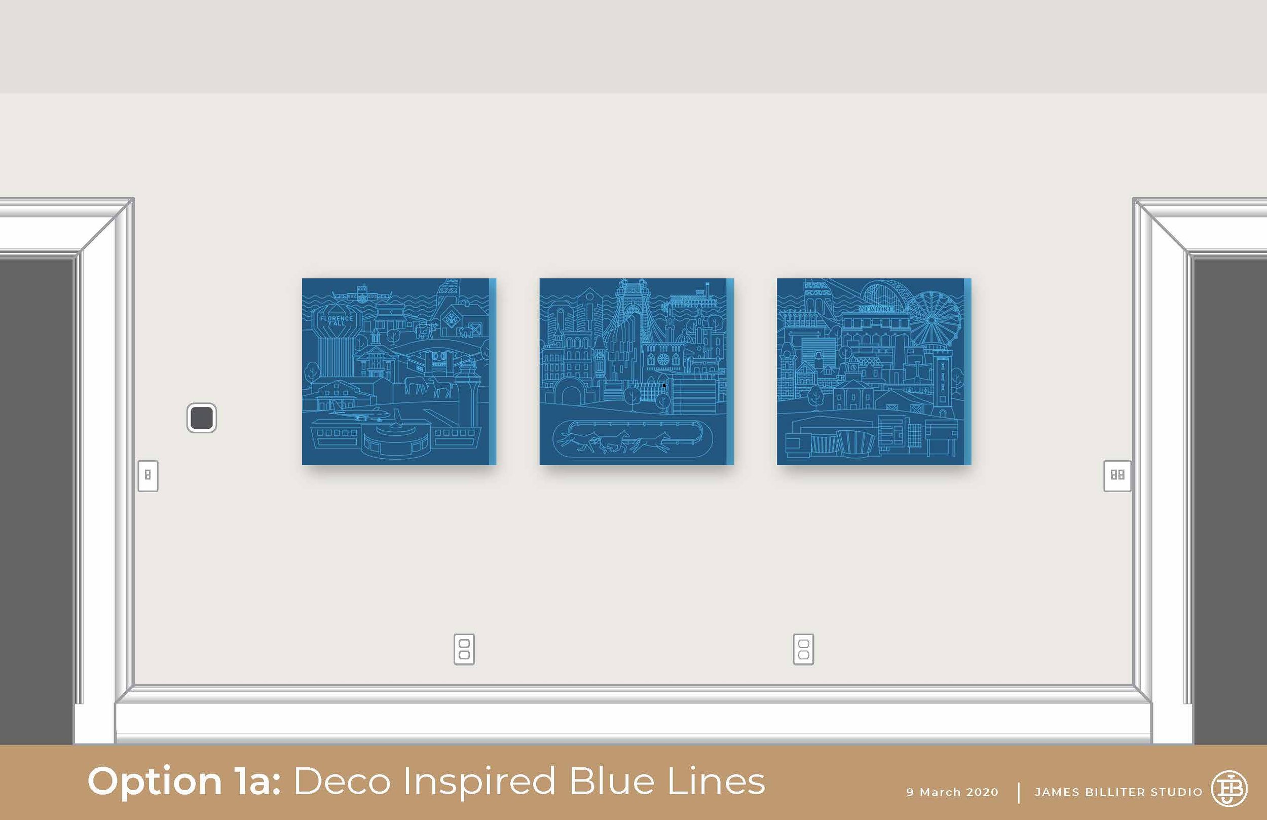
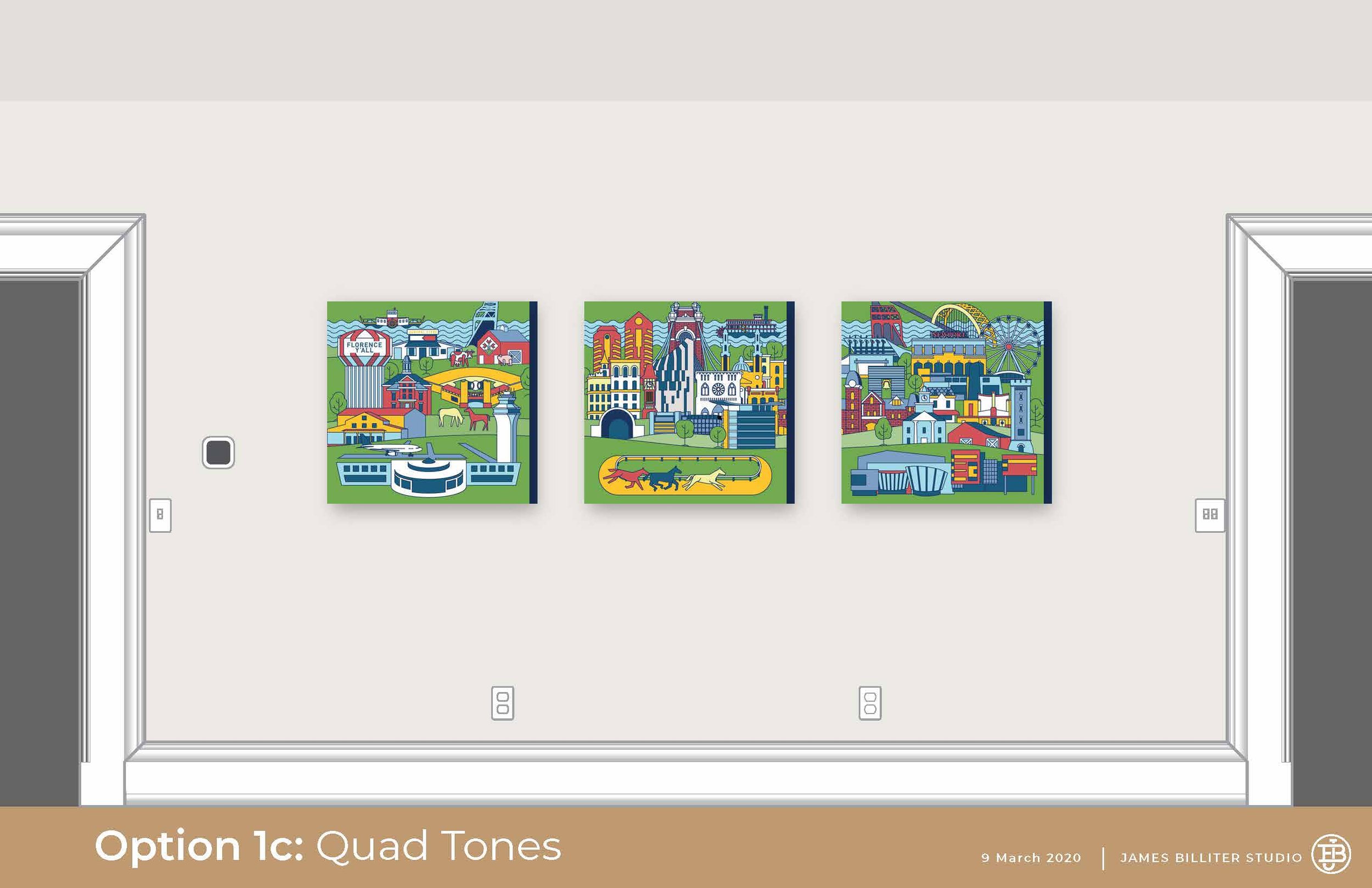
I shared several illustration style options with the client in a first-round presentation. I wanted to align but also differentiate the artwork for OneNKY from my work for Northern Kentucky Tri•ED. Since these were to be displayed in Frankfort, south of Northern Kentucky, these two concepts feature the river in the top — or north — of the composition and are also presented West to East in orientation.
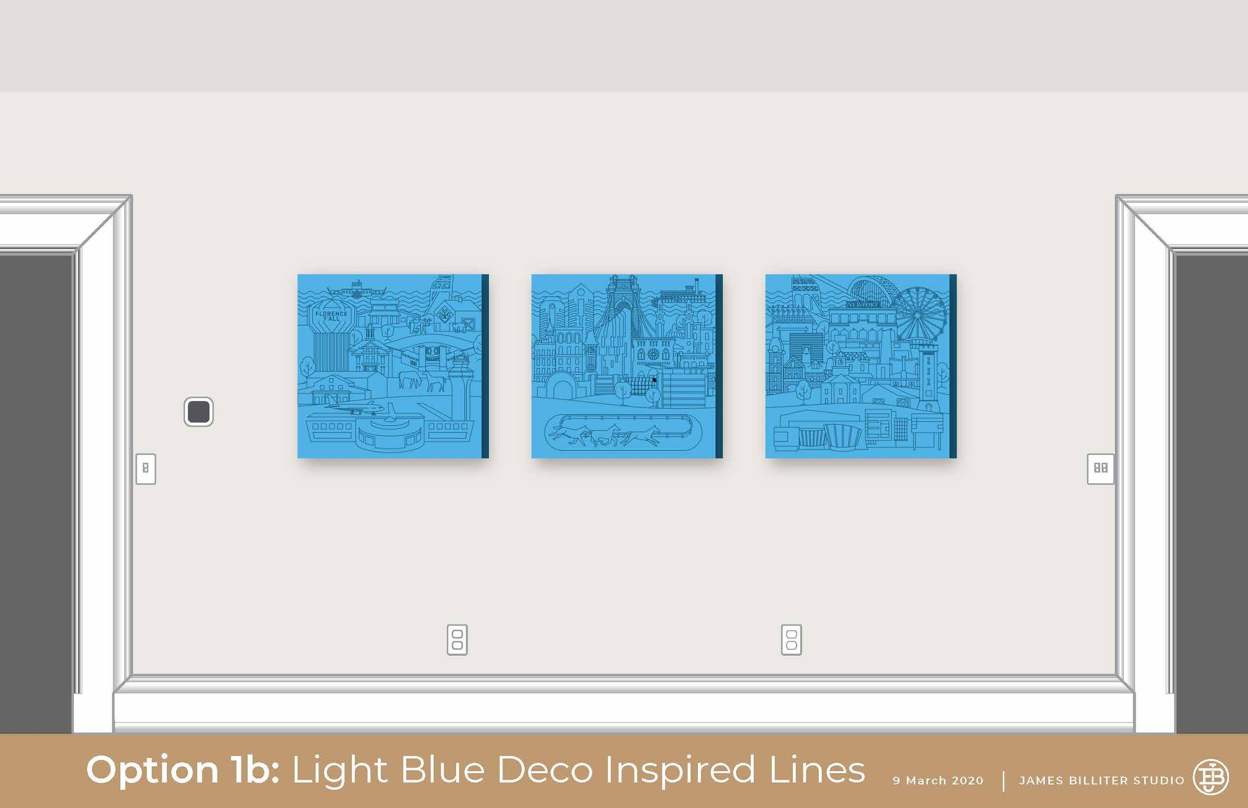
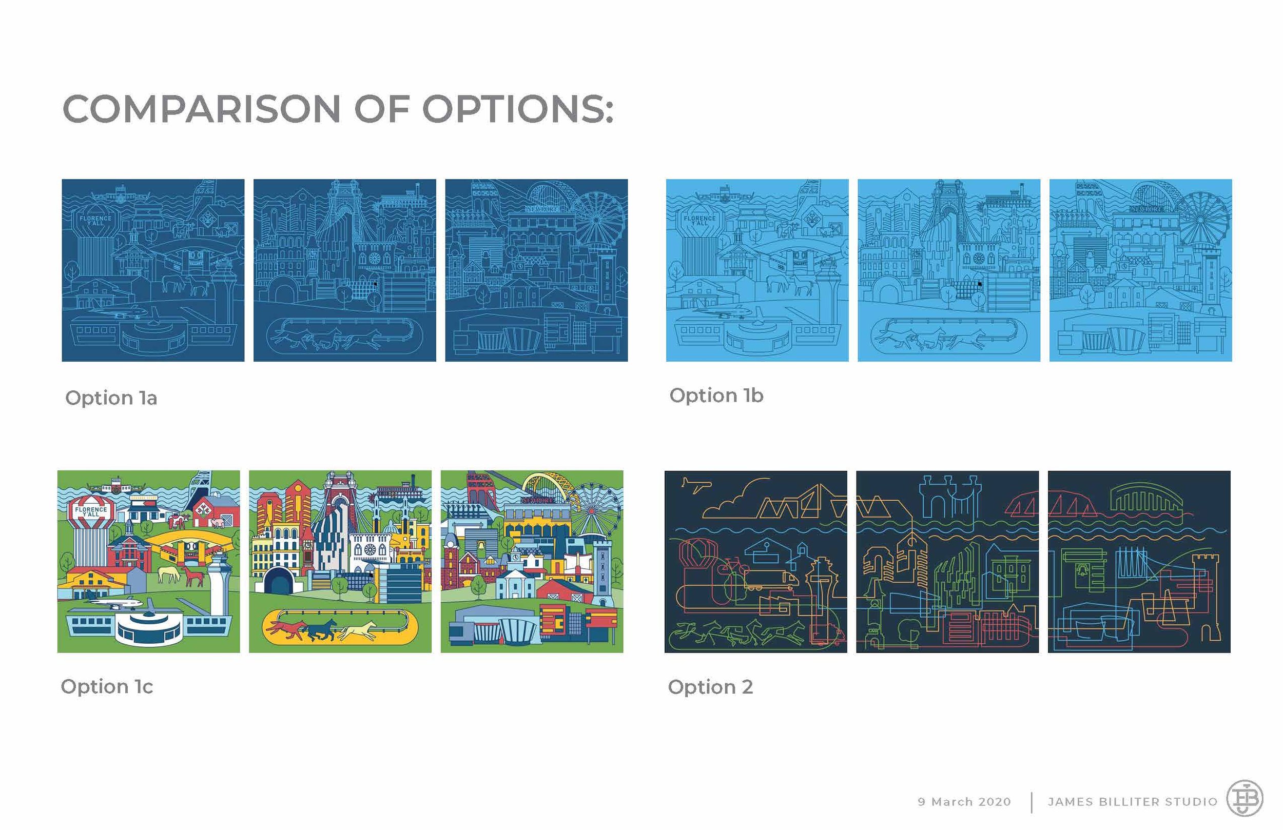
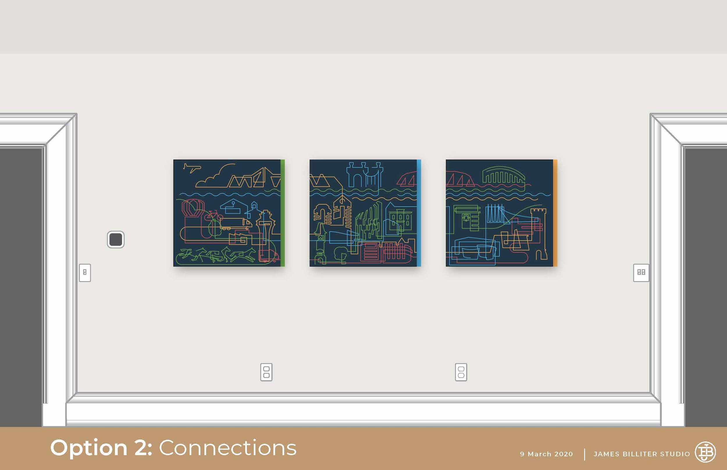
Above: The use of a minimal color palette allowed for intricacy of detail to not overwhelm the viewer. This darker palette felt refined but the vibrancy of the final pieces really compliments the energy of the OneNKY organization.
Above: This concept was inspired by the idea of connections. OneNKY’s identity uses geometric icons in four colors to describe their work in Health, Education, Job Growth and Community Vibrancy. I used these colors to illustrate the difference aspects of the community they touch and to show the connection between all of the communities.
Presentation of 1st Draft Illustration: Used a 1:12 small color elevation to present color options in context to their leadership. I provided several options to judge how much color would they like to use to activate their space.
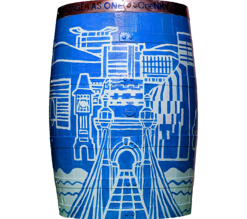
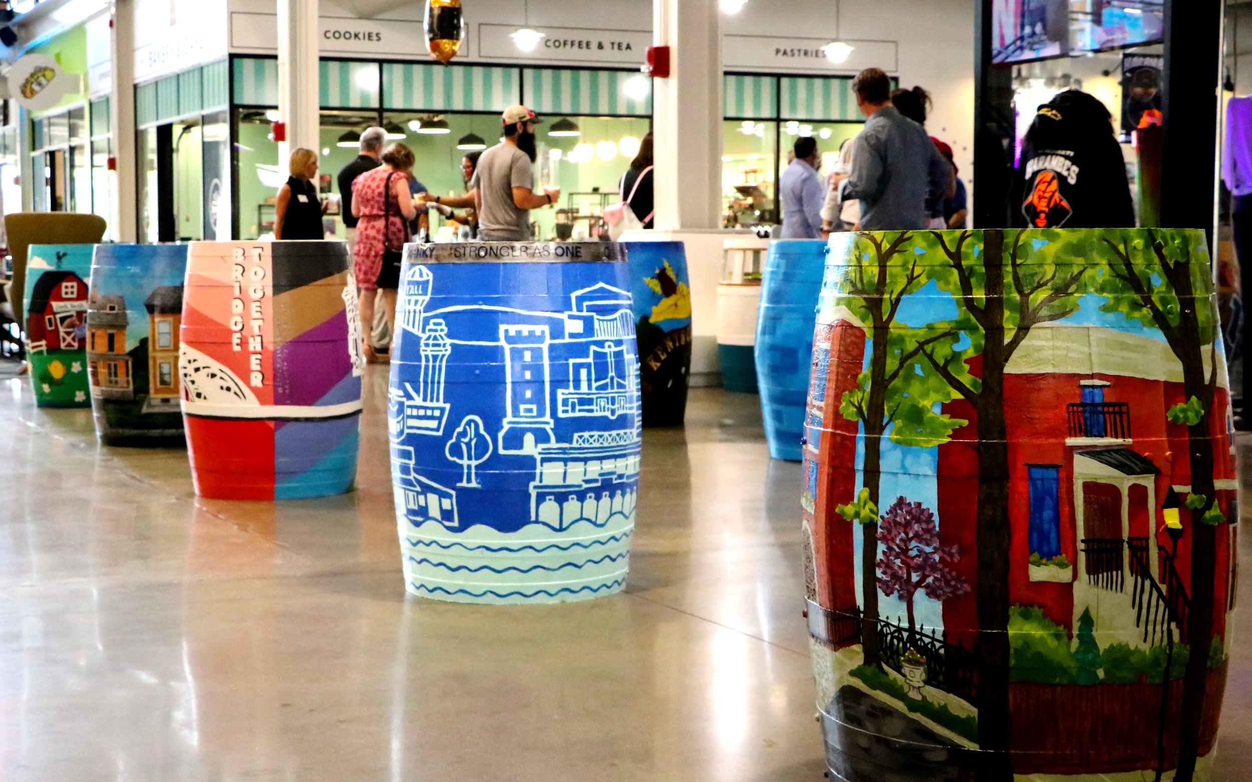
In 2022 I painted a version of their scene as part of the Northern Kentucky’s Bourbon Barrel Art Walk program.


