Trying to get back into more hand-drawn "slow design." Here is a cool process video of Kevin Tong making a poster.
James Billiter Studio Blog
Trying to get back into more hand-drawn "slow design." Here is a cool process video of Kevin Tong making a poster.

2011.21/52
England-Idlewild Race Posters
I've been helping out with race promotions for a local mountain bike race. I created a sharp and angular logo, partially because I thought it looked cool, but also it ties into the park's reputation for being filled with thorny rose bushes. Once I created the identity I created a graphic architecture to play off the unique letterforms. I also created a series of icons communicating the many activities the trails provide hikers, runners, cyclists, birders and dog walkers.

2011.20/52
Let them eat Cupcakes!
Since I am of French ancestry I like to throw a Bastille Day party — it's a different spin than the 4th and you can play up the Frenchiness a bit and act posh. Last time was a bit of a chore feeding people and being a good host, so this year I thought an after dinner cupcake party might be a bit fun, perhaps trying to pair the cupcakes with different wines.
I was inspired a Gucci script logo for the headline, but my original idea was a bit more similar to the Hostess cupcake coily pattern in the type. I created custom type design for Bastille Day, inspired by the blades of the Guillotine. And the information at bottom uses an ornate blade style box housing some classic Didot typography.


2011.12/52
Creative Juices Poster
This isn't really for anything. Someone said creative juices the other day, made me feel a little gross. This image of the c & j letterforms popped in my head and they looked a bit naughty. Perhaps some day the AIGA will need a poster for a design conference/orgy...
2011.11/52
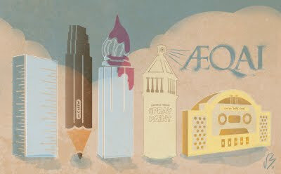
Cincinn-ARTY
Dustin, a colleague at work curates and seeks submissions of artwork for AEQAI, an online journal of Cincinnati's visual arts.
He contacted me about created a Splash page visual for the April edition of AEQAI. I wanted to create something specific for the magazine, so the idea of Cincinnati's landmarks becoming tools for making art popped into my head. A cold modernist building like the Kroger building is a ruler, the Carew Tower is a number Ca2ew pencil, Central Trust is a can of spray paint sky-writing AEQAI, the new Great American building is a brush and Union Terminal is a boom box (part of graffiti culture and performance art). I was kind of inspired by New Yorker magazine covers.
I'm excited to be part of a group of my favorite local designers like Dustin, Keith Neltner and Tommy Sheehan.

2011.7/52
In A Rut
I'm not super sure about this one yet... It's an amalgamation of Nikki McClure and Michael Schwab...
The idea is create a strong image of a rider riding through a muddy/icy rut. An image that could be easily manipulated by the colors chosen for the silkscreen — feeling like winter using blue tones or late autumn using browns.
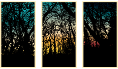
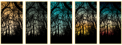
2011.4/52 Winter Sunsets
I was walking my dog in the woods and I was really inspired by the stark contrast of the bare branches and the progressing sun setting on the horizon. I took a photo and extracted the branches — intending to make a silkscreen plate from this. This one plate with a dark brown or black ink could be printed over various skies made by smearing ink and/or printmaking.
I would see this as a continual scene (tryptich) or one cropped scene printed over a series of skies. This silkscreen plate would also be cool if I traced the photograph in ink — giving the branches and trees a rougher impression.
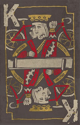
2011.1/52
I was inspired to make this "Kings of Cross" poster after attending a cyclocross race at the old Kingswood Golf Course last weekend. I love the image of a King holding a bike over his head while attempting to clear a barrier, kind of Picasso in its bending of perspective and Escher in its symmetry. I drew the playing card inpired art with sharpie and scanned it in to arrange the elements.
You can find more of my posters at Flickr.