James Billiter Studio Blog


2011.2/52

For my second week/art piece of 2011 I created identity variations on the Educational Foundation for the Colorado National Guard. I love this part of the process — creating simple solutions that are very effective and use a combination of symbols to create a new meaning to creating something abstract and poetic.

The logo I featured is a book (closed, as if finished, symbolic of graduation), tilted upwards for optimism and also to symbolize flight. I created dynamic energy within the icon which begins to imply the E anf F letterforms.

In future rounds of work I hope to create custom logo-typography as well.


This video combines moving images with crap printing techniques, two of my favorite things. I might swipe some of these techniques for a future video.
James BilliterFilm, Inspiration


This is nerdy but I really dig my new shoes from Suacony, the Jazz model with Oktoberfest Bicentennial theme. Nice attention to detail, the blue and white relating to the Bavarian flag and there is a maß of beer on the insole and a boot of beer on the tongue! Certain material, like the heel and the shoelaces are imitation leather to kick it old school. And nice hits of gold to boot. Nothing is over the top and screaming wannabe German.
James BilliterFashion
A trip to the wine and beer store always is a bit inspirational.


The intrigue of these Alpha Box and Dice wine labels caught my eye. They are designed by an Aussie firm named Mash.


I'm really digging the ornate vintage logotypes of Molly Dooker, Velvet Glove and The Bruery. I want to pursue being able to create flourishy type with mega ligatures this year.


I also love the old school Parisienne feel of St. Germain.
James BilliterInspiration


2011.1/52
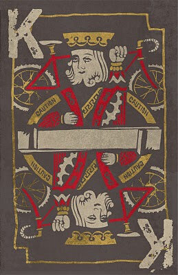
I was inspired to make this "Kings of Cross" poster after attending a cyclocross race at the old Kingswood Golf Course last weekend. I love the image of a King holding a bike over his head while attempting to clear a barrier, kind of Picasso in its bending of perspective and Escher in its symmetry. I drew the playing card inpired art with sharpie and scanned it in to arrange the elements.

You can find more of my posters at Flickr.


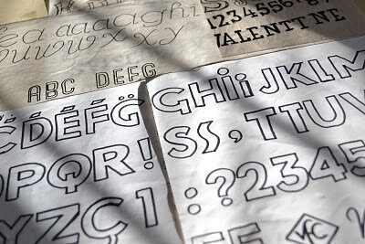
I love hand-drawing my typography. It harkens back to the old days of hand-painted signs, and photostat logos and lettering. Sometimes I trace these in Illustrator and clean them up, but other times I use them in their rough state with all their humanistic flaws and irregularities.

I did a bunch of typefaces — some inspired by the title cards in Jean Luc Godard's films, some by old art nouveau perfume packaging.

Vicious Valentine: Never Go to Bed Angry from CinéCinnati on Vimeo.


I'm still playing catch up after a vicious hard drive failure — finally putting the finishing touches on a short film Bridget, Chrissy and I made in March of 2008! It is part of my Valentine series, or "Vicious Valentines" as I am now calling them, a failed feature film that has turned into a series of shorts about a man named Dede who has very "unfortunate Februarys."

Here is a link to Chrissy's production stills of the shoot.
James BilliterFilm, Valentine

The Singing Bridge from CinéCinnati on Vimeo.


This is an example of an experimental documentary style I was developing around 2002-2006. I experimented with abstractly communicating the history of a place with only sound and image — almost if the memories of a place would come alive while you were visiting.

I just found an incomplete edit on an old disc — unfortunately my source files have been lost due to a hard drive failure and this project was never completed.

Many thanks to Chris Bautista who ran sound while we were filming. Later we had a production "wrap party" at Mullanes. Oh memories!
James BilliterFilm

My new year's resolution for 2011 will be to create at least one piece of art each week. It could be a photograph, design, film, sculpture, etc,. I would also like to share the work of my friends and followers as well, perhaps here and there we will do themed contests as well.
James Billiter52 in 2011
A bit of decadence for the holidays


For the past year my workload has been pretty diversified and I really love it. I work on everything from detergent to water to snacks to air fresheners to chocolate to liqueur and sometimes coffee and identity projects.

I love customizing a design to fit a unique brand and their consumers. I create a lot of typography for custom logos and it is something I have had a passion for since design school.
James BilliterTypography
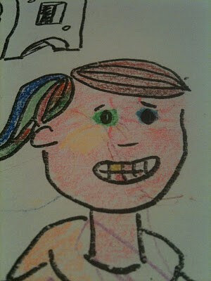
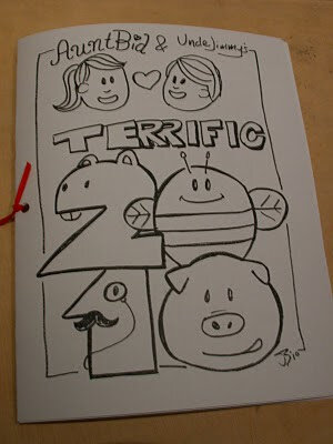
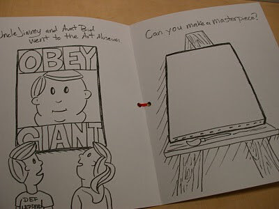
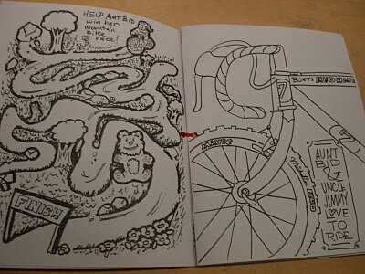
This year I drew a coloring book for my nieces and nephews for Christmas. I really loved making this for them — it is rare that anyone gets to see my actual drawings as a finished product.


Cover with Animal Numbers.


Shepard Fairey even made it into the book!


I love the detail of Bridget's cyclocross bike on the right.

I think I will do this more often. It has been a few years since I have pushed myself to use my drawing and painting skills in projects.
James BilliterDrawing, Kids


I've been racing bikes a lot lately, actually that is why I stopped posting on this blog for nearly 3 years. I have another blog called JimmyRoadRash where I also experiment with design while telling cycling stories. This video combines the aesthetic of the blog from the Summer/Fall of 2010 with video by Thomas Campbell and Brian Vernor. I really love abstract, soulful videos that capture the beauty of sport as well as at times capture what it is like to participate. Thomas Campbell's films are beautiful and there are moments in Brian Vernor's films where you feel you are in a race.


James BilliterFilm, Inspiration
Today I had the opportunity to present my film Summer at the Cincinnati Art Museum. Fortunately someone remembered my video and asked for me to present it in front of an audience. I even made a "making of featurette" that I narrated after my film was shown.


Chrissy, Tommy, Mummy & Pappy could make it, we celebrated my Mom's birthday in the Museum Café.


I'm about to wow the "crowd." I mean, I'm about to wow 4-6 old ladies.
James BilliterFilm

A short promo I created for a local Cyclocross race weekend. Cyclocross is a form of off-road cycling that requires cyclist to dismount their bikes to get over barriers, it is as much fun to race as it looks bizarre.
James BilliterFilm
The Tourist
Sunday was a beautiful day and I realized that it may be the last time I really see Frankfurt in sunlight. So I set out on my bicycle with the polaroid. I arrived at the waterfront and weaved my bicycle through the crowds and as an organgrinder worked his nostalgic charms you could hear a faint, mispronounced entschulchigung coming from the funny dressed American tourist.
James BilliterGermany 2006
Uptown Boy meets Nordic Suite Goddess
Our stomachs beinf full of Japanese delight we set out on our journey for the holy grail of suites.
James BilliterGermany 2006