James Billiter Studio Blog


I was riding my bike along, thinking about Cincinnati's (the Queen City of the Ohio) bike lane issue along Riverside Drive. We are planning on going to a bike parade and picnic on Saturday night. This image of the Keep Calm poster came to my mind and I said "God Save the Lanes!" in my mind.

I used a Queen's crown as well as a old-school illustration of a bicycle to make the poster feel, ole-fashiony! I was planning on attaching these to my bike for the parade, but the City Council just passed the go-ahead for the lanes!
James Billiter2012, Parody, Poster


I dig the video, never realized that this poster was never actually used in wartime. I like the type, it's like "what if Wes Anderson was a bloke."


12 in 12 #2
Valentine's Day

I created a fun mountain bike themed greeting card as well as wrapping paper for some gifts (fancy chocolate bar and a bottle of tawny port). I was inspired by some snowboards I saw that used a fun linear illustration style.


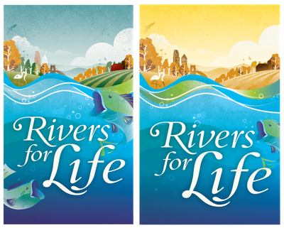
I created a new illustration for a local lecture on the environment. It was to incorporate some of the illustrations I have been developing for the past couple years. I created a full color option, but the duotone option tends to highlight the water more.


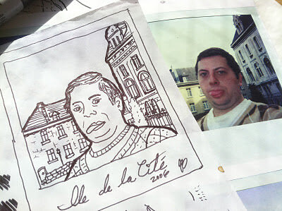
I'm kind of digging mixing photo with flat graphic shapes and textures. This might be something fun I pursue more this year. I made a little portrait of a homie for his Bday.
James Billiter2012, Portrait


I was on the Feltron website/blog and these two interesting examples of capturing time (or things we feel are constants/take for granted i.e., the sun and our appearance):

James BilliterInspiration


2011.40/52

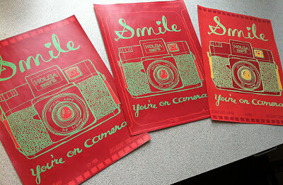
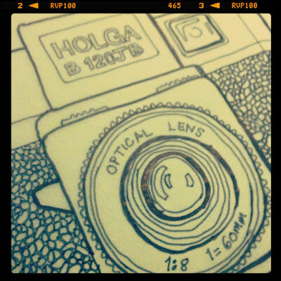
Camera Illustration and "Smile, You're on Camera" poster

I'm making the annual coloring book for my nieces and nephews and I am converting my photography into illustrations (part of the whole analoging the analog thing I've been talking about). So I'd thought I'd make a camera, then this fun poster popped into my head too.


2011.38/52

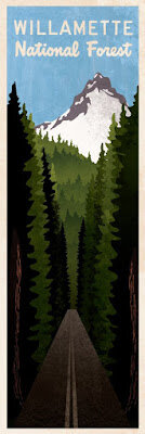
Willamette National Forest

I was so inspired by my vacation last summer. Driving through the forest, giant redwood trees would perfectly frame beautiful mountains. I started sketching while I was there and I have finally found the time to create the art.
I need to get back into film making, and to take my sport films to the next level. Here is some inspiration:

I Believe I can Fly ( flight of the frenchies). Trailer from sebastien montaz-rosset on Vimeo.


JP Auclair Street Segment (from All.I.Can.) from Sherpas Cinema on Vimeo.


"More kilometres means more fun!" - Kilian's Olympus Quest Trailer from sebastien montaz-rosset on Vimeo.


Life Cycles OFFICIAL Trailer from Life Cycles on Vimeo.


Some cool video tools and techniques:
http://www.glidecam.com/product-hd-series.php
http://www.revisionfx.com/products/twixtor/
http://www.sebmontaz.com/sections/4-film-tips/videos/238-video-tutorial-use-of-a-steadycam-for-outdoor-sport-filming
James BilliterFilm, Inspiration


What's cheaper? A letterpress or an iPad?
James Billiter


2011.37/52

Analog Analog World: Drawings of Photos I have Taken

I'm resurrecting my drawing project, turning it into a fun coloring book for my nieces and nephews. I decided to interpret some of my favorite film photographs (holgas, polaroids, 35mm, etc.) into drawings that children and adults can enjoy. I'll post more as I go!


2011.36/52

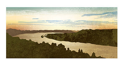
Vector Landscape: The Bend of the Ohio River as seen from Eden Park

This is a breathtaking view that I get to take in when I bike commute to work. A few years ago I go into illustration nature scenes as the background for cyclocross posters. It is interesting the see the similarities and differences between a photo and the style and embellishment that an illustration can provide.


2011.34/52

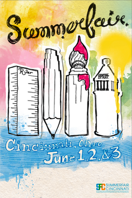
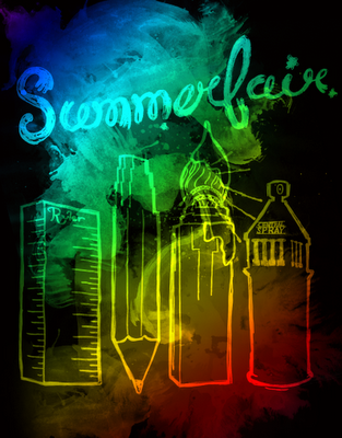
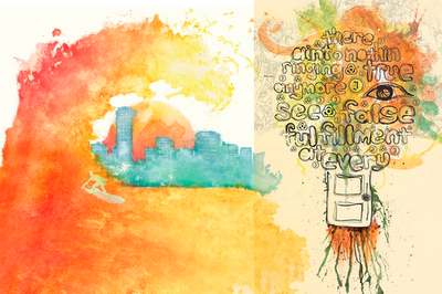
Summerfair Poster Concepts

Sometimes in art recycling doesn't pay. I thought I could take the illustrations I created for AEQAI and use them for a Summerfair poster. I ran out of time because I have been busy with work and life, so my recycling experiment failed.

Someone made the observation that it should be more about Coney Island and not Downtown. Also, I kind of felt it weighed a bit too heavily towards the visual arts. I should do more research into the event and tray again next year.

I was planning on hand-illustrating all the type on the bottom.


And some inspiration:


2011.35/52

Dandy Poster Series II

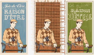
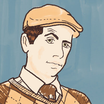
This is going to be kind of like an Andy Warhol project for me. I think I can keep tweaking and refining my portrait, and I ma planning on rolling it out with different quotes and colors. Since the last iteration I have added more detail to my face and I have a second (although less sophisticated) design for the typography. The one in the middle will be a fun tweed option to be unveiled in the future.


2011.33/52

CrossBot 2000 Costume

I really want to push myself out of my comfort zone and created something sculptural. My friend Josh made this really cool mask out of cardboard, and I really liked the idea of that. Halloween was coming up, and I was volunteering at a festive cyclocross race so I thought I would turn the project into a costume.

I was initially inspired by the geometric designs of African tribal masks, but whenever I started to sketch something it began to look way more like a robot, so I just went with it.

This is my response to a fun activity that some co-workers and I have been doing during lunch. Getting together to make quick, fun, experimental art pieces. The first session focused on our Halloween costumes. This next one may be sculptural as well.

Some ideas:
This is what I meant by Robot thingie:
http://art.kekli.fr/art-gallery/toy-custom/mozter-x-cubeecraft-papertoy

We could print blanks and draw our own characters on it by hand.


We could make our own paper sculptures much like the Curiosity Group:
http://curiositygroup.com/calendarofthemonth/


It would be cool to independently make objects but then they have to live together.
Or make a quick set and iPhone record a quick skit in the set.

James BilliterSculpture, Sketch


2011.32/52

Devou Backcountry Bonanza Poster

Ever have one of those projects where you need to get a lot of info into one device? Well, the only thing I could thing of was to go all out with fancy typography.


2011.31/52

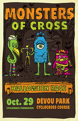
Monster of Cross Poster

I wanted to contribute to a local cause; the construction of a permanent cyclocross course in Devou Park, Kentucky. I don't have a ton of cash coming out of my pockets so I decided to set up this event and do the design for the poster.

I wanted it to be for the whole family, so I created these fun cartoon character. I wanted to continue to push my hand-drawn, from scratch, slow-design aesthetic. Unfortunately I didn't have a lot of time to finesse my work, I feel like the characters could be a bit more refined. Design and life is a process, this design is finished and I will try to improve my character design skills in future projects.