I'm having a bit of an odd year. I am fortunate to have spent 2020 focusing on my health and hopefully making some corrections to my approach in life where I take better care of myself as a creative and hopefully find more ways to balance life and work, perhaps earning more and working less (not 50-80 hour weeks, 7 days a week, 365). Well, life had other plans and it's been a busy year where I'm working a lot without a lot of profitability! So here's hoping 2022 will be better!
This year I was planning a series of bird illustrations based upon the idea of having a personal "big year" where I try to identify as many birds as I can, adding to the current birds I am aware of.
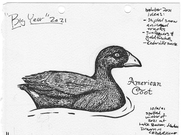
In January, I had the fortune to observe a lot of new migrating water birds at lake in Newtown called Lake Barber. I spotted flocks of these adorable American Coots.
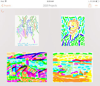
For day 1 of Inktober I felt it might be nice to capitalize on this previous prompt and finally draw that Coot! Well, I was aiming for Audubon quality, but I think I misplaced my eye too far into the center of the head and it looks a bit more Edward Gorey!
An introduction about myself:
I'm James Billiter. I created Billiter Studio to have creative freedom to create my own work — to explore themes of history, architecture, nature through the graphic arts and printmaking. As a Cincinnatian I was naturally drawn to our local culture and I have connected to the community and grown an audience through my work's celebration of our culture.
I am a DAAP graduate (Graphic Design, 2001) that started my business as a creative outlet nearly a decade ago. For the past two years it has been my sole income. My company has two main facets: I am an artist/illustrator who is commissioned by companies and I also sell my artwork in "retail." For artwork sales I have found that I have to rely upon a diversity of revenue streams: such as in-person retail at markets and events, wholesale retail, internet sales, galleries, licensing and passive income.
I practiced as a graphic designer for agencies for 17 years and when I started creating my artwork it showcased my abilities and illustration and lettering. Having a creative outlet making my prints has provided me with a venue to perfect and showcase my skills. Building up my artwork and brand helped me create a customer base that also enabled me to find a client base for my commissions.
1) Who would you say your customer base is? Do you have a target audience or did you start with a target audience? Has it shifted over time?
My mission has always been to provide quality artwork that is affordable and handmade. I love having a studio practice where I can create work with my hands, but I also embrace the aspects of design such as using technology and allowing scale to enable an affordable product.
When I started I would say that my customer base was more niche, a younger audience of college students and young professionals. As the events I participated in, as well as the communities I served became more popular my customer base grew and I would say it is definitely a little more mainstream now. Also, the lovely thing with social media is connecting with a modest audience of customers and other creatives around the globe.
2) How has Covid19 affected your business? Has there been a shift in what people are purchasing or who is purchasing?
First off, I want to say that I am taking this very seriously. Often in my work week I meet hundreds of people in a week, and the thought of potentially spreading the virus unknowingly is terrifying.
I create physical objects, they are at a studio and I use the postal service to ship these items. The gravity of the situation made me question would I want to risk the health and lives of others just to sustain only part of my livelihood. Having multiple revenue streams meant I could brainstorm and experiment with new ways to create revenue.
I have noticed that some people really seek a return to normalcy. During the quarantine a few people reached out and I felt uncomfortable because I was taking the quarantine and stay-at-home orders fairly seriously. Feeling some people were ready, I did re-open my online store in early May and letting customers know of the timeline they should expect to receive their artwork.
In-person retail accounts for about 30% of my annual revenue (online sales are 9% and passive income/ licensing around 1%), I immediately recognized that this is an extremely unsafe activity until there is a vaccine. Short term during the quarantine I made sure to emphasize products that are passive income, i.e., products that are digital downloads. I also created items that were of comfort and with so many people unemployed, I created digital items that were very inexpensive or free.
I really wanted to embrace the idea of what is "essential." Having experience in fashion as well as in ceramics I feel that those expressions are very utilitarian and they not only help cloth us and feed us but the expressive aspect of these mediums surrounds us with objects that we enjoy or become part of our personal self-expression. I would say overall that my medium is much more of a decorative art and is extremely non-essential. I immediately asked myself "why/how am I relevant now." I feel that once we are safe there is still a need to have hope and delight in our lives — these are aspects of my work that I’ve always clung onto and I have to hope that I can continue to provide these for my audience.
I did also ask myself, how can I be of greater help. I immediately began to create free artwork, typically coloring pages, to benefit other organizations. I’ve also been using a portion of my sales to help fund raise for causes that are affected by COVID-19. I am currently working to develop some items such as facemasks and other products that might help us navigate opening economy before having the safety of a vaccine.
For later in the year, I am ideating ways to provide a safer environment for my customers. I rent a studio space and potentially enabling shopping appointments and curbside pick up would be great ways to still provide my artwork to my audience without exposing them to events that typically feature crowds of thousands of people. If the economy does not rebound and the job loss is sustained, I also wish to connect with others through my art (either by providing free artwork or free, safe opportunities for individuals to co-create art).
Lastly, short term I am offering personal contact-free local delivery of orders to ease the burden on the US Postal Service.
3) What method do you use to reach current and potential customers the best? i.e. social media, galleries, art shows, etc.
I have not yet gauged customer confidence using social media — I could use Instagram stories to take a quick poll or have customers fill out a survey. I haven't done this yet, I suppose I have the luxury of
Speaking of social media, I am using IGTV and Instagram for longer form videos about my process, I also plan to use IGTV and a YouTube channel as possible ways to have free art classes. I am also ideating if there’s a way to create inexpensive art classes that could be downloaded from my website.
I would say that I greatly benefit from the popularity and audiences of the events I participate in. Like most of us, there’s so many ways to communicate out there that I often wonder how effective is social media (especially when I see data around the number of impressions to likes to visits to purchases — if 3000 people see an image it feels like sometimes I have 1 sale!). But I would say that it has really helped me build my career and I have been utilizing social media and my online shop much more now to communicate with my audience.
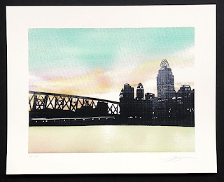
For the past decade, I've also been inspired by sunrises and sunsets and the silhouettes of urban and nature scenes with these dramatic backdrops.
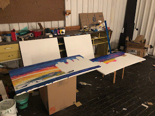
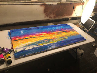
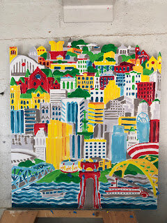
From April 2018 to November of 2019 I was working on this painting in my Northside studio. It was a reaction to the rigid geometric paintings I've been creating with flat fields of color.
What if I follow the geometric forms with more gestural strokes?
Also on this piece, I cut the top of the composition to follow the skyline... Not sure if this would ultimately compliment the looser style?
Another critique I received was this composition might be too complicated for this gestural style.
I want to work within myself to explore things I currently create to make sure I am content with every nuance but also to explore new styles I might with to work in.
I want to gain peer and audience feedback about my current work and the new work if these styles will continue. I might use audience testing, from current audience as well as poll people unfamiliar with my work. I also plan to share with respected peers — it is so long since I have had a critique!
Also, going forward, I want to create more work that benefits the greater good. Currently I use some artwork to raise money for the preservation of certain landmarks. If I create nature prints, I hope to be able to give back to the environment.
Business-wise, I am lucky to have enough inventory to last several years. I am currently working with DIY to create enough prints, especially smaller format, to last this year. I plan to keep this work online, in my current retailers, and to continue to attend my summer shows.
I should try to fit in Summerfair and Hyde Park if I can — it might be difficult to apply since I will be teaching at UC and working on commissions but I will try.
Gallery shows, I hope to share some work at Paper Wings in OTR. Other possible spaces in Cincinnati would be 1305 Gallery, the Mariemont Women's Art Barn (loft) and possibly to reconnect with Pique, frameshop, Villa Mocha and Skeleton Root. It would also be interesting to show at The Summit Hotel in Madisonville someday.
Once some new work is created, it would be lovely to approach galleries elsewhere.
I would love to gift myself a "residency" here and there. To exist in another city or culture and create work reacting to it. Perhaps, if I visit my sister in Germany for long periods I can create work inspired by my visits and possibly show the work there.
I know blogs can be outdated, but I think using this platform to share this work will give me a little permission to be experimental since it is outside my usually platforms for sharing work that is for sale.
How long have you been an artist/designer?
I have been a designer and illustrator for nearly 20 years, and have been printmaking for the past five years. I also minored in art history and my work often references the past 150 years of graphic design.
What in your youth/childhood helped you decide to become an artist/printmaker?
My mother was a commercial artist/designer when I was young and I would often draw while she worked at a drafting table.
Has your work changed over the years? How so?
I like to continually challenge myself with greater difficulties and increasing the amount of detail in my work.
Tell us more about your process.
Printmaking allows for me to elevate graphic design to a fine art through attention to craftsmanship. The creative process doesn't end with the image — paper and ink can add so much beauty and finesse to a piece.
I love to create an image that stops the viewer at a distance, and continues to delight them with fine levels of detail as they get closer to my work.
I research my subject matter and develop content. Typically I take between 10 to 20 hours to illustrate my prints. I then spend around another 5 hours to create custom headline typography. I also like to include other design elements like borders, patterns, monograms.
How is your work different than other artists doing Cincinnati-themed works?
My career as a graphic designer is what makes my work different than other artists depicting Cincinnati. I consider graphic design the marriage of image with typography to communicate a message.
Whose works are you influenced by?
My "heritage-style" of very intricate illustrations of architectural landmarks is inspired by great draftsmen and architects like Samuel Hannaford. My other style is a playful geometric pop-art illustration style that is influenced by artists like Keith Herring, Mike Perry and Charley Harper.
For your "love" series, what's your process, technique and how do you choose images to go in the heart?
For the Queen City Love, I thought it would be a fun image to place our skyline in a heart as a way to celebrate our city's great civic pride. I have created an initial run of letterpressed prints and cards with Rachael Hetzel of Pistachio Press as well as a run of larger screenprinted posters I made in my new studio in Northside.
On writing poetry, Jane Kenyon said, “Be a good steward of your gifts. Protect your time. Feed your inner life. Avoid too much noise. Read good books, have good sentences in your ears. Be by yourself as often as you can. Walk. Take the phone off the hook. Work regular hours.”
Yellow first, straight from Magenta, adding 20% transparent extender base Cyan, adding 30% trans 80% trans, with black
Prefers a halftone of 35 frequency for 230 mesh screen
I have been going at it this way, I add 50% transparent extender base to magenta and cyan. I heard that if your image is blue or green in overall tonality, print cyan third — if it's warmer or redder, print magenta third. I tried to print yellow first once — but it was hard to register second color through the yellow mesh.
I've been also preferring 30-35 dpi, I think I printed a smaller 8x10 print at 50dpi. I think a 50dpi on a 18x24 print would be very inconsistent.
Angles of colors:
Cyan 80 degrees
Yellow 105 degrees
Magenta 20 degrees
Black 50 degrees
I don't start at 45 degrees because it creates angles the eye can pickup.
I am intrigued with using ceramic tiles as plates for printmaking. For instance, blind embossing or calliography
It looks like it is best to used 3/8" mahogany, poplar, ash, birch, apple or cherry plywood with an AA grade. Softer woods like pine and cypress could also work, but will break down over time.
https://letterpresscommons.com/wood-cut/
http://www.briarpress.org/25767
I want to thank ALL OF YOU for the tremendous support this year! I am proud that my artwork has helped raise donations...
Posted by James Billiter Studio on Friday, December 25, 2015
